
So far, what I am learning about myself as a designer is that I have a hard time leaving humour out of the equation. For example, last week, I suggested that we dump baking soda in the ocean to help the pH and strap aquarium filters to dolphins to protect them from the folly of man. This week is no different.
My task for this week was to design two posters that advertised defamiliarized objects (and, as a consequence, to engage in the defamiliarization of two objects). The easiest way to explain what that means is to direct you to this video:
(Any blog post where I get to put in a video of The Little Mermaid is good by me!)
Defamiliarization takes an object and reimagine a use for it, or imagines what an alien consciousness would think it was used for, if they didn’t have anyone to explain it to them.
This assignment was way harder than I expected it to be. I guess that this means that I have trouble separating some objects, especially the really familiar ones, from their uses. I think that if I had chosen more complex or uncommon objects, it would have been easier to defamiliarize them, but then they would have meant less because they were less recognizable to start with. Some objects were harder to separate from their uses than others – for example, I could not seem to dissociate chairs from sitting.
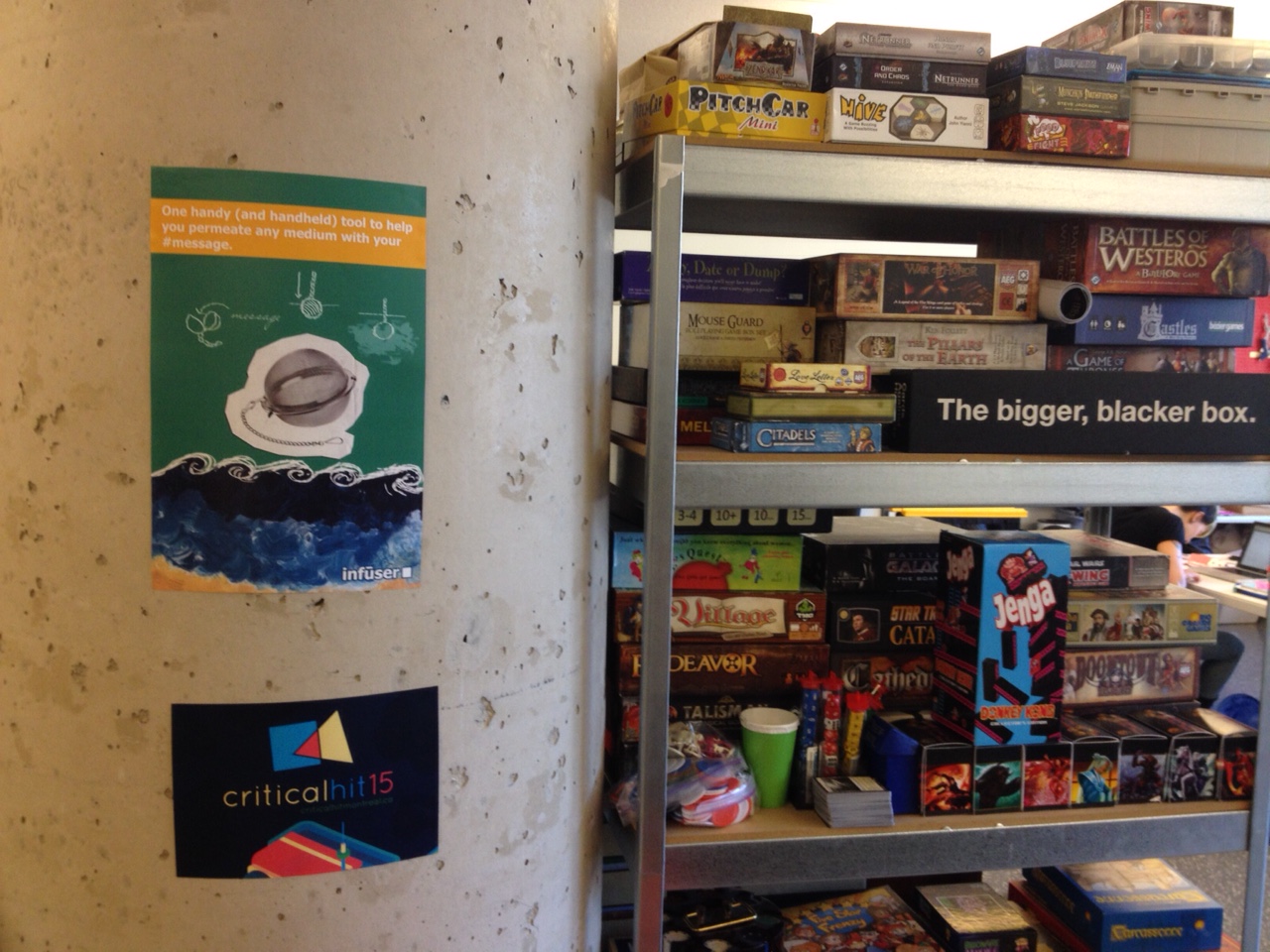
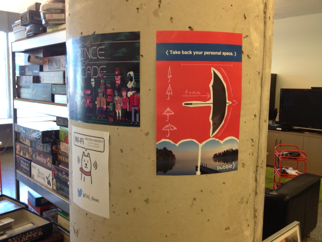
Here are the results, installed in the “wilds” of the TAG Research Lab:
Since I had two posters to design, I chose to approach each object with a separate way of attempting to defamiliarize them.
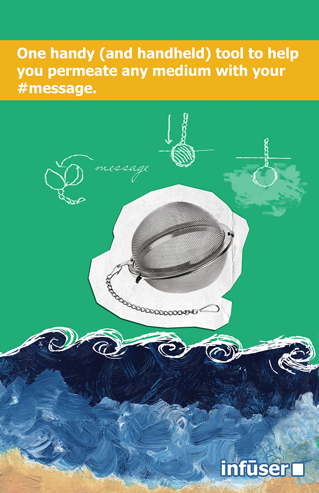
The first object, the “infuser,” was designed using a language-based approach. I thought about the words “infuser”, “diffusion,” and other related terms. I worked at defamiliarizing the language associated with what infusers do, and thought of words that had multiple meanings, such as “medium.” What I ended up with is partially a visual gag and partially a verbal gag — many mediums are present on the page: water – and paint representing water, print, paper, writing, and the internet (represented by the hashtag). Then, for good measure, the phrase references Marshall McLuhan and that tired, oft-misunderstood old chestnut, “the medium is the message.” Of the two posters, I think this one is the least successful.
(FUN FACT: The painting in the bottom third of the poster is something that I painted when I was 15 years old.)
The second object, the “bubble,” was not what I had originally decided on making. Initially, and yeah, this one might also have come to me in a dream, much like the DELFINOX, I wanted to design a clock that would teach you to dance based on the different gradations. As you got better at learning dance steps, you would use shorter and shorter intervals to learn. So, you could use the different intervals on the clock – seconds, minutes, 5-minute chunks, 15-minute intervals, half-hours, whole hours. It quickly became clear that this would be impossible to communicate in an ad or on a poster.
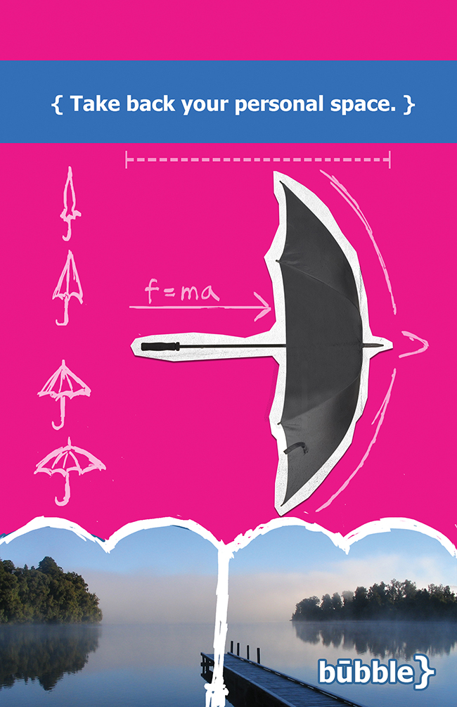
The bubble, instead, is based on something that tall people know all about: accidentally hitting people or being hit with an umbrella. Or, in the case of this object, not so accidentally. This object imagines leveraging this accidental quality of the umbrella with intent – to take back one’s space. About some of the visuals in the poster: the trees at the bottom with the empty space in between are meant to recall large crowds which have been parted to leave elusive personal space in-between! The formula, f=ma, is meant to suggest the motion of the umbrella, coupled with the directional arrow. The curly bracket is also vaguely shaped like the top of an umbrella, which is why I also included it in the “logo.”
So far, the posters have been up for about five hours, and already a few people have commented to me that they love the idea of taking back their personal space. I was very stealthy when I put them up, and surely no one knows their source.