Speculative Play: Deep Time and the Onkalo RPG

adventures in gaming, game jams, Process Writing, research

file_001

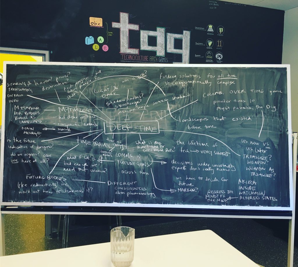
After spending the weekend immersed in thoughts about Deep Time at the Speculative Play Deep Time jam this weekend, it turned out that my Monday night RPG/board game group didn’t have anything to play that night. During the weekend, we had watched “Into Eternity” (http://www.intoeternitythemovie.com/) and thought about Onkalo (a waste-storage facility being built 4 or 5 kilometers deep in the Finnish bedrock), as well as nuclear waste more generally. Our discussions about deep time had talked about problem of designing for someone who might or might not share the same physical attributes, sensibilities, and senses. We talked about how difficult it was for the human brain to conceptualize a 100 000-year time-span, given that our own recorded history is so short and yet older events still feel so remote. We talked about intergenerational communication and responsibility, the durability of different materials and how to communicate broad strokes in imprecise mediums – perhaps things like massively-scaled stones, or “universal” symbols like thorns or other things that might represent danger to some unknown beings. We also thought about whether such warnings would only spur on treasure-seekers, who, unconvinced of the altruism of the people sending such a message (well, altruism except in the sense of assuaging our own guilt, perhaps), might think that something valuable was being hidden from them. And, given that nuclear waste materials can be reprocessed, and that a relatively small amount of their energy is used before the material is considered waste, it might be considered valuable indeed.

Given that I am moving to Alberta fairly soon and that our membership is already becoming increasingly scattered (Guelph, NYC, Regina…), the RPG group is working on strategies for being able to continue playing when we’re apart. So far, we have had mixed results with digital play, and of course it comes with a whole host of potential challenges with regards to tech, lag, internet issues, etc. Meeting for a casual board game wouldn’t further that cause at all, and I had been itching to run a game of my own for some time. I used to run a Star Wars expanded universe campaign, but it became too much for me to manage, and so I hadn’t actually “GMed” in years — there just seemed to never be enough time. Fresh off of discussions from the weekend, I decided that, given a simple enough system (Fate Accelerated, in our case), I could indeed run a one-shot campaign on-the-fly that evening.

I decided that I would give the group very little context, asking them only to give me information about who they were as a people (human, genetically-modified/differently-evolved humans, aliens). Their constraint was that they had to be of a similar size to humans (somewhere between human-sized and elephant-sized). My primary goal was to balance feasibility and fun, and so I did have to invent and alter certain details that may not be within the realm of possibility. Admittedly, although the results of this campaign were an interesting enough way into this design problem that I am now writing about it for you here, my primary motivation was running the game in a way that would be compelling for the players. Having dedicated so much thought and consideration to Deep Time and Onkalo over the weekend made them convenient subjects for exploration, and I thought that the ideas would work well in a one-shot campaign rather than something more sustained.

The players were experienced roleplayers from different backgrounds, although all were Canadians from the East Coast (Ontario and Quebec), including a biochemist, a store manager, a researcher working with Montreal’s itinerant population, and a bank worker. Although the group usually has an even gender split, the players this time were three male-identified players and one female-identified player.

Here is what they decided about themselves, their society and their context:
The game was to taking place 90 000 years in the future. The group was part of a race of genetically-modified humans that eventually evolved further to become quite sea-mammal like — specifically, they decided that they were the Otterfolken and had large lung capacity, webbed hands and feet, oily fur to protect themselves from cold in the water. They also decided that they would have bronze-age technology (and were quite insistent that this should include Archimedes’ death ray). Their characters were part of a caravan traveling across the land, seeking trade goods. One of them was the caravan chef and mixer-of-medicines, one of them was a religious elder/prophet who had visions, one was the caravan funder, a rich otterperson who was seeking adventure, and the other was a youngling who was in charge of caring for the caravan’s animals (these pack animals were known as “Finless”). Additionally, I seeded the adventure by giving them each one piece of information that none of the other players knew: the rich caravan funder knew that there were areas on this landmass that had not yet been scavenged by other caravans, the animal-tender knew that the area they were entering had very hard bedrock and was considered very stable (not prone to natural disasters, volcanoes, flooding, etc.), the caravan cook knew that food sources were getting more scarce and the land less hospitable as they ventured onwards, and the religious leader knew that there were legends/stories told in his religion about “places that you are supposed to forget, places that no one should ever go, deep places, sacred places” and that most of these were on land.

file_002
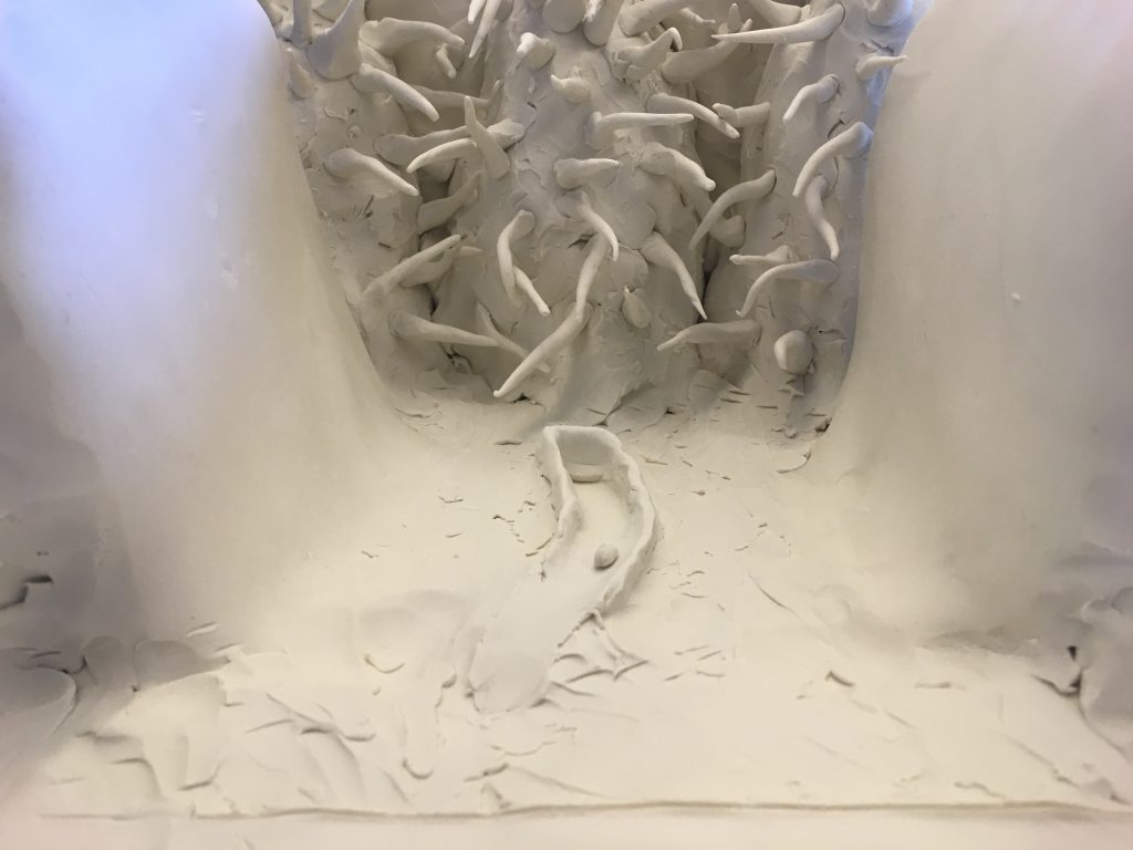
(That tiny track and even tinier truck represent the entrance to Onkalo).

Over the course of the weekend, Rilla Khaled and I explored questions around what we ended up calling “communicative geographies” — what kinds of human-made geographies could be used to primally communicate, beyond language, that Onkalo was a place to be feared. Using plasticine (reusable modeling clay), tin foil, and plastic cups, we built a structure that was designed to surround Onkalo. We were inspired by the shape of the Hoover dam — smooth, and descending at a terrifying angle — and by the idea, brought up in “Into Eternity,” that thorns were a threatening shape, one that might potentially still be understood in 100 000 years. So, Rilla and I surrounded the entrance to Onkalo with spikes on two sides and Hoover Dam-like curves of self-healing concrete (using bacteria) (knowing that such concrete is probably not infinitely self-repairing, we still decided to imagine it as such in a speculative future), all of this on a massive scale designed to inspire feelings of the sublime in the viewer.

For the RPG, I thought about Onkalo as more of a fortress – the huge thorny spikes on the outside, and smooth, Hoover-dam inspired bowl on the inside. To make it possible for the game to proceed, I decided that at some point since their creation, one small section of the spikes had fallen or been sheared off, allowing a climbable surface in one spot, should the adventurers decide to undertake such a climb.

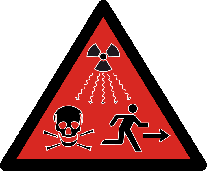
Additionally, I surrounded Onkalo with other safe guards, attempts at communication: obelisk-like structures (some which had collapsed) with information in every known language, and a field of flowers, genetically-engineered to recoil away from other varieties to help them grow in set patterns (and also poisonous), forming the shape of a giant pictorial radiation warning as seen in the Onkalo film. However, the warning was designed to be seen from a birds-eye view, and they could not completely discern the pattern, although that they knew there was one (until, of course, they reached the top of the ominous structure, looked back and said “Oh, no!” — but their characters didn’t understand the symbols anyhow).

radioactivity-symbol

As the game played out, it became clear that the players, with no context, were playing out scenarios and thinking in ways that were consistent with our discussions over the weekend. When faced with a mystery, and in the context of the RPG, their solution was to go further and solve it. When presented with ominous symbols and danger, they decided that there must be something worth protecting hidden beyond — and, in the case of one character, their primary motivation was adventure-seeking, and this definitely looked like adventure.

The fact that this all took place in the context of an RPG night can’t be overlooked. This is the metagame — the tension between player knowledge (such as knowing the symbol for radioactivity) and character knowledge. The players knew, of course, that if I was leading them towards a certain place, there would be danger. This place wouldn’t just contain a pile of treasure for them to find. And although they discussed turning back many a time, they never did. The context of the game (and perhaps the lack of real-world stakes) encouraged them to move forward rather than turn back. But is the curiosity that drove the Otterfolken to Onkalo only human?

As I slowly pulled back the curtain and they discovered maps of the space within the Onkalo archives as well as more obelisks with writing and symbols, the group seemed driven by two motivations: uncover the rest of the mystery, and act according to the characters that they had set out for themselves. Afterwards, I gave them context for their adventure, telling them about “Into Eternity,” Onkalo and the weekend’s projects and adventures.

After this foray into using RPGs to explore a design problem, I’m convinced of their potential value as a design probe, especially for the Speculative Play project. Given time and space to do so, all humans are capable of speculation.

Crossposted here and here.

Critical Making and Design: Cultural Ambassadors

adventures in gaming, critical making, Process Writing, research

This week, I made a game called Cultural Ambassadors by attempting to defamiliarize Space Invaders and the act of shooting.

Given that I had just a week (and that I am trying to limit the number of hours I spend on this one class), I started with someone else’s Space Invader clone made using Construct 2. In playing it, it quickly became clear that this wasn’t quite a perfect clone of the original game, but close enough for the base on which I would build this new game.

GolbosonGlobesletter

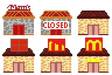
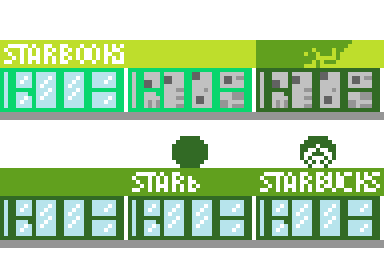
Taking a common way that I’ve seen defamiliarization explained (“What if an alien encountered this cultural object – how would they understand it?”) to its natural conclusion, I made a game where aliens are enamoured with our television commercials and think that places like Starbucks and McDonalds are really kind of awesome — and isn’t it a shame that not everyone has access to the rolled back prices of Walmart? So, helpfully, the Golbos on Globes team (they were very impressed by Holmes on Holmes and Extreme Makeover: Home Edition) has decided to make over your planet…starting with your town. And by you, I mean a tiny robot carrying a book with the ability to beam cultural objects up to these aliens to counteract all that they have learned from cable commercials.

bookrobot

As errant hammers fly, there’s the chance that they’ll miss the building that they are converting and accidentally hit you instead. Meanwhile, you send them books, movies, games, music and other cultural objects to take a look at. Those who are affected by them have minor epiphanic moments (“oh I see”, “I understand!”, “now I get it”) and leave Earth’s skies.

Here is the list of items that the game chooses from for you to throw:
“Throwing Cultural Object: ” & choose(“Octavia Butler’s Kindred”,”Will Shakespeare’s Plays”,”Gone Home by Fullbright”,”Jesus Christ Superstar”,”Amadeus (1984)”,”Tanya Tagaq’s Throatsinging”, “Thomas King’s Green Grass Running Water”, “Schindler’s List (1993)”, “Europa Europa (1990)”, “Carl Sagan’s Cosmos”, “Anita Diamant’s The Red Tent”, “Marjane Satrapi’s Persepolis”, “Kurt Vonnegut’s Welcome to the Monkey House”, “Squinky’s Coffee: A Misunderstanding”, “Margaret Atwood’s The Handmaid’s Tale”, “Harper Lee’s To Kill a Mockingbird”, “S. E. Hinton’s Rumble Fish”, “Jean Paul Riopelle’s La Roue/Cold Dog – Indian Summer”, “The Inevitable Defeat of Mister and Pete (2013)”, “Idiocracy (2006)”, “Journey by Thatgamecompany”, “Anna Anthropy’s dys4ia”, “Ralph Ellison’s Invisible Man”, “Arundhati Roy’s The God of Small Things”, “Bryce Courtenay’s The Power of One”, “Paul Coelho’s The Alchemist”, “Richard Adams’ Watership Down”, “Papo y Yo by Minority”, “Simon and Garfunkel’s The Sound of Silence”)

Given that the game was made in under a week, I mostly went with what occurred to me to chuck at aliens if I wanted them to understand my culture beyond McDonald’s commercials – which feels fine for a prototype. However, also, given that the list is short, each entry matters more… I had to decide if my loving a cultural object and thinking that it was interesting was enough for it to go on the list – and I tried to mostly stay away from “canon important cultural objects”, which are mostly the work of dead white dudes, and instead include a bit more variety. Then again, I happen to love Shakespeare and chose to include his work — and I guess that it’s okay to appreciate and love an object even understanding that it might contribute to a problem or be problematic, something that I occasionally wrestle with. I tried to balance it out with work by creators that I feel might be underexposed or would be excluded from the canon.

McDonaldsStorefront

StarbucksStorefront

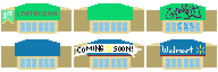
WalmartStorefront

Something that you might be interested to know is that I have never made a game that involved the act of shooting before. That’s a conscious decision and that might actually be why I chose shooting as something to defamiliarize. However, because I started from Space Invaders, there’s some meaning embedded in the rules already, and the act still feels oppositional. There’s a lot of history in the act of shooting, I guess, and shooting hammers or wifi beams doesn’t erase that, especially in as familiar an object as Space Invaders. Trying to get shooting to feel like something other than shooting is difficult. What I think does work is this idea of accidental or unintended harm on the part of the aliens and their colonizer attitude. What doesn’t work, is, as I’ve mentioned, this sense of opposition — that we should shoot at the other, or assume that they mean us harm.

One of the things that I am quickly realizing about my approach to design work, having done three projects in three weeks, is that I enjoy making things that revolve around some element of humour, but that I want my audience to be in on the joke – or I want it to be possible for them to be in on the joke without too many obstacles.

Critical Making and Design: Defamiliarization Posters

critical making, Process Writing, research

So far, what I am learning about myself as a designer is that I have a hard time leaving humour out of the equation. For example, last week, I suggested that we dump baking soda in the ocean to help the pH and strap aquarium filters to dolphins to protect them from the folly of man. This week is no different.

My task for this week was to design two posters that advertised defamiliarized objects (and, as a consequence, to engage in the defamiliarization of two objects). The easiest way to explain what that means is to direct you to this video:

(Any blog post where I get to put in a video of The Little Mermaid is good by me!)

Defamiliarization takes an object and reimagine a use for it, or imagines what an alien consciousness would think it was used for, if they didn’t have anyone to explain it to them.

This assignment was way harder than I expected it to be. I guess that this means that I have trouble separating some objects, especially the really familiar ones, from their uses. I think that if I had chosen more complex or uncommon objects, it would have been easier to defamiliarize them, but then they would have meant less because they were less recognizable to start with. Some objects were harder to separate from their uses than others – for example, I could not seem to dissociate chairs from sitting.

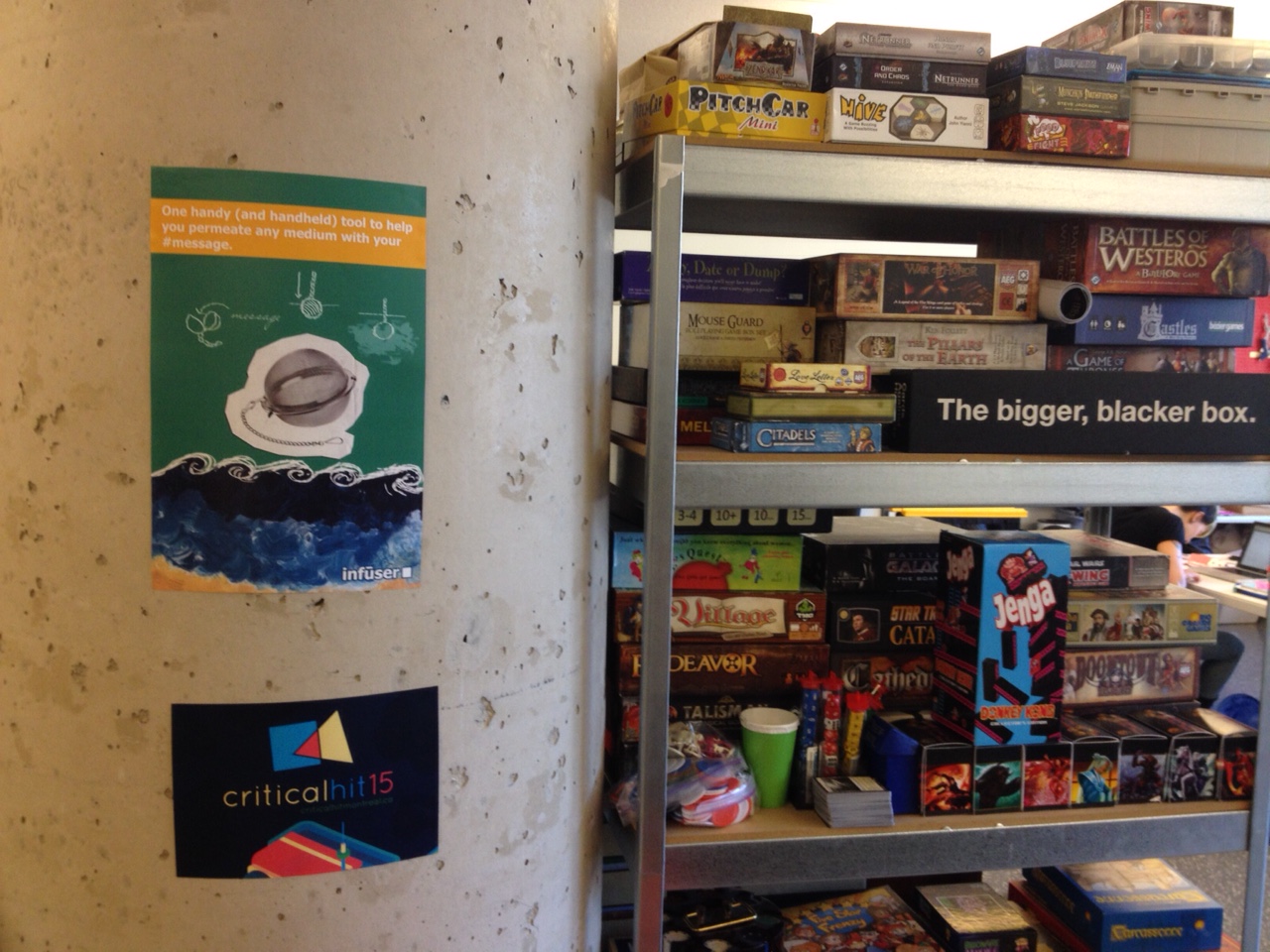
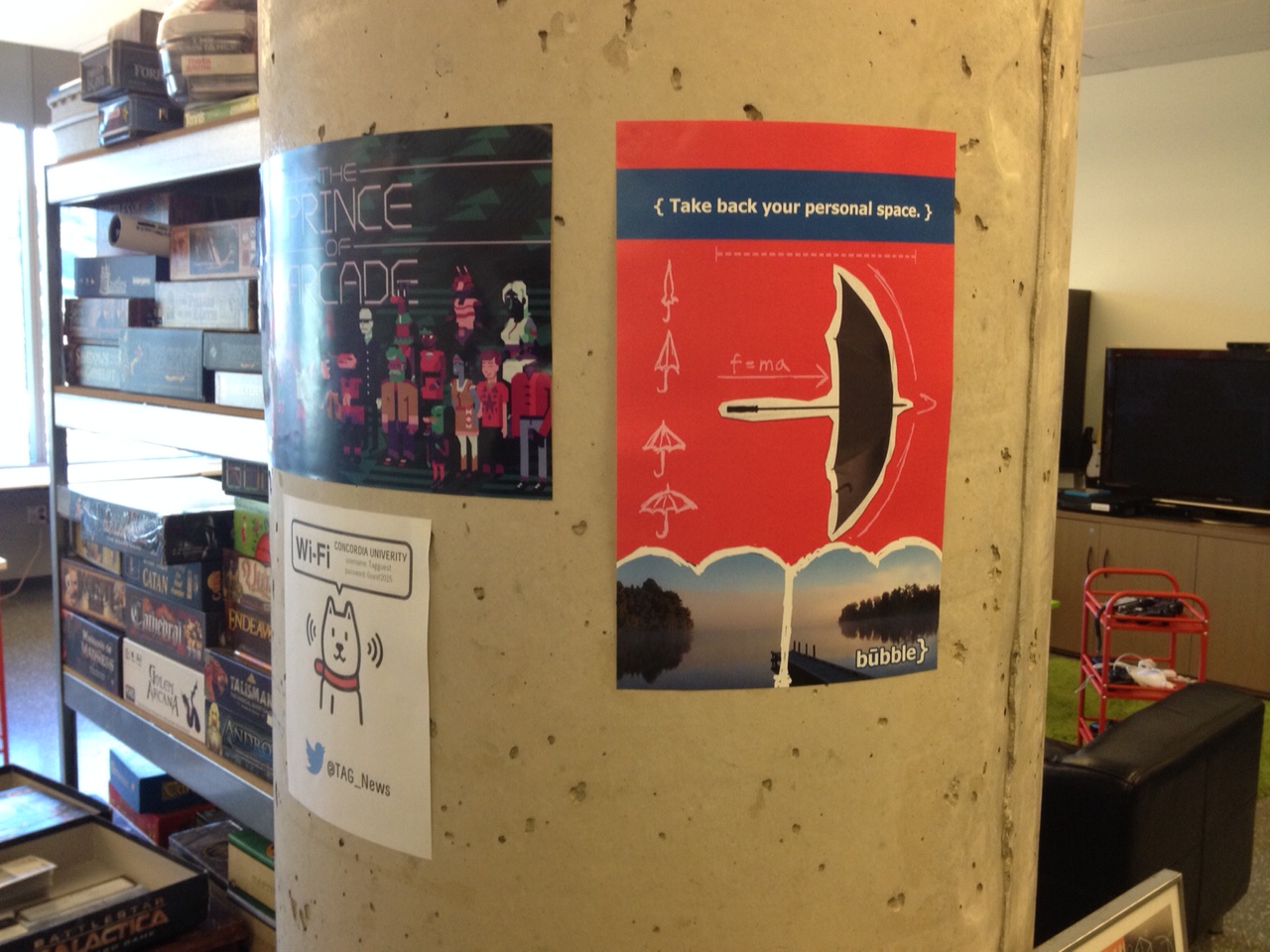
Here are the results, installed in the “wilds” of the TAG Research Lab:

theinfuserInstalled
MyBubbleInstalled

Since I had two posters to design, I chose to approach each object with a separate way of attempting to defamiliarize them.

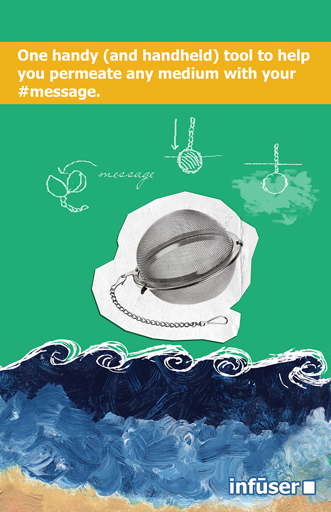
theinfusersmall

The first object, the “infuser,” was designed using a language-based approach. I thought about the words “infuser”, “diffusion,” and other related terms. I worked at defamiliarizing the language associated with what infusers do, and thought of words that had multiple meanings, such as “medium.” What I ended up with is partially a visual gag and partially a verbal gag — many mediums are present on the page: water – and paint representing water, print, paper, writing, and the internet (represented by the hashtag). Then, for good measure, the phrase references Marshall McLuhan and that tired, oft-misunderstood old chestnut, “the medium is the message.” Of the two posters, I think this one is the least successful.

(FUN FACT: The painting in the bottom third of the poster is something that I painted when I was 15 years old.)

mybubblesmall

The second object, the “bubble,” was not what I had originally decided on making. Initially, and yeah, this one might also have come to me in a dream, much like the DELFINOX, I wanted to design a clock that would teach you to dance based on the different gradations. As you got better at learning dance steps, you would use shorter and shorter intervals to learn. So, you could use the different intervals on the clock – seconds, minutes, 5-minute chunks, 15-minute intervals, half-hours, whole hours. It quickly became clear that this would be impossible to communicate in an ad or on a poster.

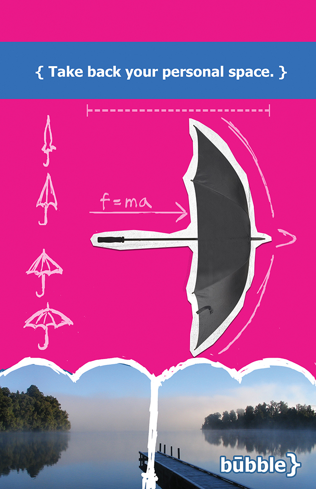
The bubble, instead, is based on something that tall people know all about: accidentally hitting people or being hit with an umbrella. Or, in the case of this object, not so accidentally. This object imagines leveraging this accidental quality of the umbrella with intent – to take back one’s space. About some of the visuals in the poster: the trees at the bottom with the empty space in between are meant to recall large crowds which have been parted to leave elusive personal space in-between! The formula, f=ma, is meant to suggest the motion of the umbrella, coupled with the directional arrow. The curly bracket is also vaguely shaped like the top of an umbrella, which is why I also included it in the “logo.”

So far, the posters have been up for about five hours, and already a few people have commented to me that they love the idea of taking back their personal space. I was very stealthy when I put them up, and surely no one knows their source.

Critical Making and Design: Thinking about DELFINOX

critical making, Process Writing, research

This September, I’ve officially started my PhD, and with it, a pretty amazing directed reading course with my supervisor, Dr. Rilla Khaled, entitled “Critical Making and Design”. Since we’re keeners, we started a little earlier than the class start date, and I’ve already had the chance to do a bit of design work and am learning a lot. With that in mind, I’ve decided to start this series of blog posts talking about the design process and the objects themselves.

The first object is called the DELFINOX and it is a filter system for dolphins to help them in their “double-bind” between ocean acidification and pollution and air pollution. Here is a PDF document that is meant to accompany the object.

Delfinox Picture small

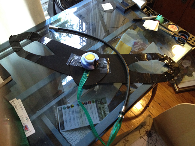
This is the object itself. It’s made of mostly recyclable, reusable or reused materials, with the exception of some duct tape and a few materials that I’m unsure about. The blue plastic is PLA, or polylactic acid plastic. The green tubing is recyclable plastic, possibly originally intended for aquarium use. The black rubber hose is borrowed from a small stash of extra scuba diving equipment that my household has around. There’s also crafting foam used to approximate neoprene and part of a household sponge for the filtration system.

The instructions for this object were fairly free-form – in a nutshell, they were to make a thing and see what happens. Dolphins were not my first thought.

At first, I discussed what I had to do at length with just about everyone who I happened to be spending time with – friends, family, other researchers. I was excited – this was my first official PhD assignment after all – and my first formal design object.

So far, the critical design examples (and I’m using that term very broadly, thinking of design as a spectrum where designs can be critical or affirmative of existing norms and practices to varying degrees) that I’ve been reading about are, at their core, about anxieties or fears. Many deal with the fear of death in some form, whether it be Dunne and Raby’s huggable plush mushroom clouds (from Designs For Fragile Personalities in Anxious Times, 2004/05), or the Prayer Companion (an object that I find a bit questionable, both in terms of taste and the tone in which the project is framed).

At first, in searching for my design inspiration, I thought a lot about waiting. I thought about what I do when I’m waiting, how waiting alters my perception of time, how maybe waiting could be a good thing – which led me to the converse. What happens when waiting is a really bad thing? What happens when we wait too long?

I’ve been a scuba diver for eight years now, and a human being on the planet earth for, oh, just a little bit longer than that. I think about water a lot – and that means I think about climate change and their impact on the water, too. It is something that makes me anxious, because it often feels like I have very little direct control over it. And, although I am hopeful, so far, we have been surprisingly short-sighted and stubborn as a species when it comes to our approaches for dealing with climate change.

Now, I know this is a bit silly, but after thinking about the project for a few days, the idea for DELFINOX came to me in my sleep. In the morning, I joked with Tom (my husband) about it a bit, as I imagined this object: “What are we going to do, fit aquarium filters onto all the dolphins? Well…maybe.”

Despite knowing that the object would not in fact have to work, and would probably never be within 100 kilometres of a dolphin, it was nevertheless important to me that my approach was possible, if improbable. I studied dolphin physiology – specifically, how dolphins breathe and how blowholes work, and I thought about how my scuba diving equipment operates. I wanted to design something that, in theory, wouldn’t need an air tank (even rebreathers need a small cylinder). However, most dolphins surface fairly often for air (about every 15 minutes or so), so it wasn’t necessary that there be a whole lot of air in the system, just that it could filter through the system sufficiently to be scrubbed before the dolphin needed it, or enough for there to be an emergency supply. So, I added a longish tube that would rest against the dolphin’s body.

In terms of powering the device, dolphins swim fast and can expel air fairly strongly through their blowholes. It made sense to me to use the motion of the dolphin to power the device, sort of like the way that the motion of the water is used in hydroelectricity, or, that classic comic idea of a hamster running in a wheel.

My choices when it came to crafting the physical object were based on three goals: trying to reuse objects that I already had on-hand (such as previously printed items from my 3D-printing recycling box, or the borrowed scuba hose), trying to remind the viewer of an aquarium filter, and trying to make choices that would be comfortable, unlikely to be torn off, and practical long-term for a dolphin.

In a way, this object, although the notion of fitting each and every dolphin with one may seem impossible, is about taking back control over something that seems so far beyond my control. Feeling a personal responsibility for climate change as one of billions of people is an uncomfortable feeling. This object imagines a future or even a present where human beings do feel responsible for each and every dolphin, for example, and take personal responsibility for them. It is too easy to lament about climate change and say that there is nothing to be done. Collective actions start with individual ones, I guess.

A SMALL SIDEBAR: Because this came up when I was talking about the project a few times, I thought I’d share this somewhat gruesome story that I had in mind while working on this project. Dolphins have a particular history here in Montreal: for Expo ’67, the city acquired dolphins, which were hosted in the Montreal Aquarium (also known as the Alcan Aquarium, a company my father used to work for). After Expo, people sort of forgot about the aquarium, and in 1980, there was a blue-collar workers’ strike. The six workers who were responsible for feeding the dolphins refused to do so, and three of the six dolphins starved over a course of months. Their trainers tried to save them at the end, but they waited too long.

You can watch footage of their arrival to Montreal here.

Here are two newspaper article detailing the event at the time:
The Evening Independent

Spokane Daily Chronicle

3D Printing: We <3 Making a Pip-Boy 3000

3d printing, Process Writing, research

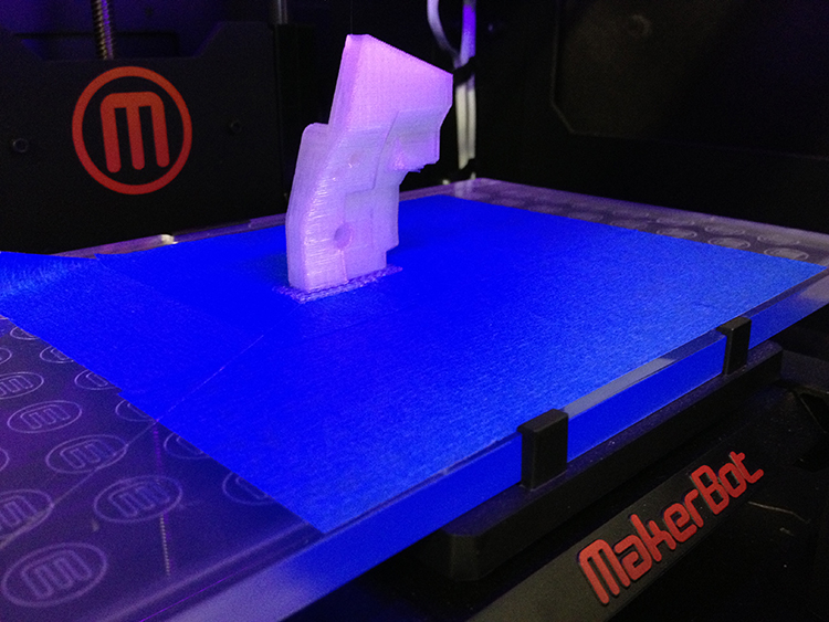
printinprogresssmall

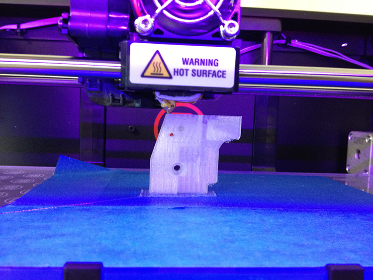
The MakerBot makes its industrious sounds at me and I want to work harder, be more efficient, do more in my day. For the past few days, I’ve been tethered to TAG’s own MakerBot Replicator 2 on my first serious 3D printing project – and by serious I mean most intensive.

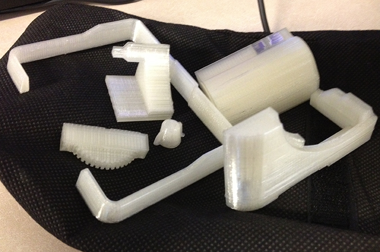
The object that I am printing will be made up of fifteen parts, many of which take over two hours to print, depending on the settings and the size of the part in question. One piece took only ten minutes while another took six hours. I am making a Pip-Boy 3000 from Fallout 3 using a model from the Thingiverse that I found here. Later on, I will need to acquire small magnets, LEDs, and Velcro straps, to experiment with acetone and plastic sealer to see its effects on the PLA. But first: the 3D printing.

finishedprintssmall

I would never have dreamed of having access to a 3D printer this time last year, so this is just one of the many ways that TAG has made my life more interesting (thanks!) and I would never have felt confident messing with what sounds like such a complicated machine without the help of Gina Haraszti, who helped me learn the ropes of 3D printing in the spring. It’s not so scary, really.

finishedprintsmall

The truth is, the MakerBot has helped me to work harder in the past few days. There’s a certain meditative quality to the way that it hums as it lays down layer after layer of 0.25 mm thick PLA plastic, and sometimes the sounds are almost musical, like when the MakerBot prints something round. Being forced to stay in one spot if I want to use my computer while the printer works has also forced me to focus, and actually, in the spring, while first experimenting with the 3D printer, it is what allowed me to finish my game for Pippin’s Curious Games Studio (well, chances are I would have finished either way, but I remember one extremely productive six-hour session in the Lab where I managed to implement an entire new feature and fix all the bugs that were plaguing me up ‘til then).

The road to 3D printing 15 different parts with different weird shapes is not without its problems: during one three-hour printing the extruder became blocked while I was away (one really good reason to stay at the Printer’s side or check it very, very often) and the Replicator continued to get instructions, meaning that I had an extruder extruding nothing in mid-air. I unloaded and reloaded the filament, and the problem was solved, but I wasted a solid hour before I noticed that it wasn’t extruding.

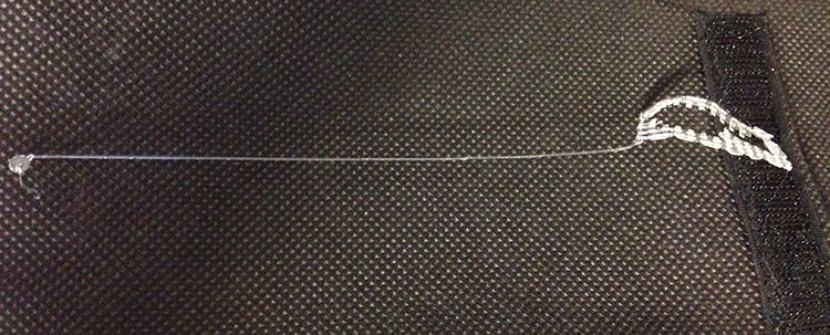
Another problem that I had was with the filament creating what some people call “spaghetti” – filaments that don’t attach to the object being printed and that create curls and loops, which, if you’re lucky, don’t get incorporated into the structure of what you’re trying to print, but that can create a serious mess if you’re unlucky, requiring a total reprinting of the object. One of the parts that I printed had a gear-like “dial” edge, and when I printed it laying down, the bottom ridge of the dial always turned sort of spaghetti-like (I printed it twice this way before printing it standing up).

filamentandraftsupport

I tweaked the default settings a bit, using slower speeds to achieve higher quality, and using a slightly-thinner-than-normal filament width to create a tighter structure. I feel pretty confident about the correspondence between the abstract numbers in the gcode settings and what I can expect to come out of the printer now, although I think that overall, when you find the sweet spot for whatever it is you’re printing, I’d recommend not messing with it too much.

Time, is, of course, a factor: how functional does the cool thing that you’re printing need to be? Is it just a display object? The fill percentage, the layering speed, the layer height: all of these factors can add or take away hours to the length of a print job. One of my objects, at 40% fill because I wanted it to be more structurally sound than my 30% fill objects, took six hours. But overall, I don’t regret a single minute spent creating this object that exists in a video game in the (plastic) flesh: the moment of seeing something that has existed only on a screen made real is perhaps unlike anything else that I can describe. Try it and see.

heartmaking

I’ll share some pictures of the finished product once it’s done, and more about this adventure later! Meanwhile, enjoy this video of MakerBot singing!

Curious Games and Critical Hit: Playtesting

adventures in gaming, curious games, indie, playthroughs, Process Writing, research

Yesterday, the Curious Games Studio showcase joined forces with the first Critical Hit playtest. So bitter! So sweet! So bittersweet! (By which I mean I’m really going to miss having Pippin Barr around – he’s our first Visiting Game Designer and he leaves Montreal today. Pippin is excellent at giving creative feedback and working with him during the Curious Games studio has changed the way that I think about game creation, especially in regards to my role as a game creator and in terms of what it is possible to do in a game, even with limited resources. Thanks, Pippin!)

Something especially interesting about this joint playing was that I have a game for the Curious Games studio (as you all probably know) and I had a paper prototype of our game for Critical Hit out as well. This is something else that I never would have expected – having enough games in progress to playtest two of them at once. Madness. (Really – I spent a lot of time trying to move between both games. Unfortunately, that probably means that they were both a little underplayed – but it still felt good to have that much to show.)

Another upshoot of this was that I didn’t get as much of a chance to playtest other people’s work, but, at least for Curious Games studio, I know that there’ll be an effort to put all of the games online, and I’ll be sure to post them here, and I’ll have other opportunities to playtest my fellow Crit-Hitters’ (hey, how’s that for a group name, TAGsters?) games. What I did get to playtest was all a super-effective use of our eight weeks of class-time: a creepy home invasion game with a sinister ending (this is a pun about fire – all the internet points if you kind of get it although it’s not a very good pun), a game where you just can’t win with your high-maintenance significant other and a game where your job as the game’s camera is to keep Sir Capsule alive by properly panning around and alerting him to dangers ahead (Capsule being the default sprite in Unity if you don’t create a model).

So, here are some of my notes about the playtests as I think through what people’s reactions mean:

NITROGEN NARCOSIS
There were two major physical problems that I didn’t anticipate during the playtest. One is something that would only ever occur if it was necessary to play the game in a room full of people: it’s really annoying and almost impossible to put headphones on over a scuba diving mask. A solution might have been to use earbuds, but in my experience (at Pixelles when I forgot to bring headphones), people are reluctant to share earbuds, and probably rightly so. The other is very simple, and something that should have occurred to me since I wear them half the time myself: glasses. Scuba diving masks and glasses. When I mentioned it to Pippin, he said basically that it was another opportunity for something funny to happen: people having to lean in close to their screens to play. Maybe. I can’t really think of another solution. I have the option of wearing contacts that I usually carry with me, so it didn’t occur to me, although maybe it’s not a problem I would have been able to fix even if I had thought about it ahead of time.

From a programming perspective, I noticed a bug when playing the game through multiple times: the air sometimes doesn’t reset to its original levels and I noticed that people had a lot of trouble with accidentally clicking on the whistle instead of the piece that they wanted and that they usually seemed to forget entirely about being able to move the perspective around using the arrow keys. The whistle thing was intentional, although I disliked that it interrupted the gameplay and might try to do something like make it even smaller or put it someplace where the player is unlikely to click it by accident.

People seemed to mostly enjoy the novelty of the equipment and sort of marvelled at the difficulty of playing the game in the equipment compared to without. I should add that using the particular mac mouse that we playtested with was plenty difficult without gloves as well. Something that I wasn’t altogether satisfied with but that I think is overall unavoidable is that I found the process of getting on the equipment and the process of adjusting the mask sizes to be slow and cumbersome to the process of playing the game. Honestly, it does mimic reality: getting equipment on and off is something that divers have to deal with and we all have our rituals of what goes on first, what goes on last, and everything in between. But I hadn’t intended for the equipment process itself to be a part of the game because I only really needed the difficulty to be part of the gameplay.

I watched about six pairs of people play the game. I was again struck by the way that the interaction between the two players is really what makes the game – the experience of playing together and laughing together was wonderful to watch. I also got to think more about my own design and how I seemed to have unconsciously embedded more aspects of nitrogen narcosis than I had thought: for example, it’s possible to play five games of tic-tac-toe throughout the game (or more if you run into extra time and Player 2 is willing to drag around Player 1’s ‘O’s for him to the right spot and not cheat…) and tic-tac-toe is a simple enough game that that’s arguably pretty repetitive. As I watched people play yesterday, I remembered a story that I had heard about a diver whose responsibility it was to tie a line to a wreck. He wasn’t able to tie the knot properly and someone else took over for him. Later on, at depth, he found an end of rope that wasn’t tied to anything, and, being narc’d, he started to repeatedly tie knots in it, as if trying to fulfill his earlier responsibility. He would have done that until he ran out of air had his buddy not noticed and brought him up (it’s my understanding that the knot-tying diver was actually violent in his desire not to stop his work). I’d say that out of the six playthroughs that I saw, in four cases both players seemed to really like it, in one playthrough the players seemed a little mystified, and in one case the equipment seemed to interfere with the enjoyment of the game.

What seemed the most successful overall was the interaction between programming and the physical world – how what someone was wearing in the physical world affected what they were able to do in the programmed space. That’s pretty cool.

ROSIE ASSEMBLED/THE ZOMBIE CYBORG GAME

For this playtest, I was specifically trying to see how people felt about our two gameplay mechanics: the ideograms (if they were communicating properly and were fairly easy to interpret) and the block puzzles (specifically: how people felt about them and their relationship to the body that they created).

The answer for the ideograms is a resounding yes: people almost always got the sense of what they were supposed to mean without any help (although there may be a slight learning curve to learning the “language” of our particular ideograms), and what’s more, they really enjoyed them. I think that it would not be difficult to expand our ideogram “vocabulary” as much as we want, because all that’s involved is drawing a 2-D ideogram with no frills – just an outline, really. When the ideograms weren’t clear, people sometimes chose them because they enjoyed their ambiguity.

The answer for the puzzles is unsurprisingly complex, and it revealed a great deal of complexity in regard’s to people’s thoughts about body image.

How the playtest worked:
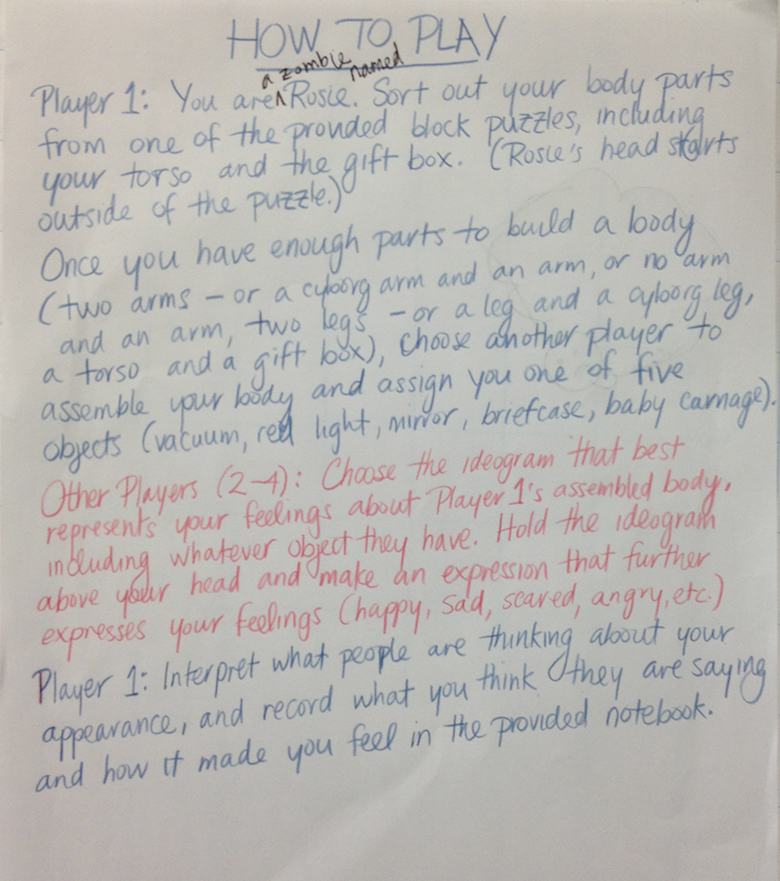
I provided written instructions to the players and then tried to step back (although most people didn’t really read them and I ended up explaining things that were on the sheet every time anyhow – I don’t mind, it gave me a chance to interact with the playtesters).

playinstructionsZCcrop

So, as I mentioned, the ideograms really seemed to work. Where things get much more difficult is in the matter of the block puzzles. As a mechanic for sorting out which body parts the player got, the block puzzle seems to work well metaphorically. Where things get more complicated is in terms of which body parts are included in the puzzles.

One person noted that she would have chosen Rosie’s body parts except that she didn’t want to have tattoos (Rosie’s body has tattoos because of her backstory) – she didn’t like tattoos and didn’t feel that they properly represented what she wanted. That’s really interesting because it points to stigma that we didn’t consider: it’s true that there are still some people who feel strangely about tattoos – especially, for example, in a professional workplace (although I’m under the impression that this is less of a problem than it used to be, I really don’t know).

On the other hand, this is a game about being pressured to make choices that the player doesn’t necessarily want to make – in terms of what their body should look like and what career they will end up in. This same player felt that we should include more varieties of body part (maybe we can vary them between the puzzles, because we do have a limitation for the number of blocks that we can include in the puzzle). She also suggested throwing in one other accessory to help narrow down the character’s role – something that the player gets to choose. In terms of blocks, we do have two pairs of skinny arms (that was to increase the likelihood that the player would feel the need of choosing a skinny block) and we could change one for something else, but we really have to think about what that choice would mean.

Another playtester said that they weren’t sure whether they were happy with their body: “I found it hard to tell if I was ‘happy’ with my body… I didn’t have any sense of its utility, for instance. I was inclined to just like it because it was mine.”

Personally, I don’t want players to dislike the body that they end up with – I think that the reframing of the body will only happen when they interact with other zombies – which, for the playtest, were simulated by the crowd of people and the ideograms – and people were allowed to choose whatever ideogram they wanted. In the context of the game, the zombies will be choosing from a more limited set based on what body parts come out and what “stereotype” object the player has.

Similarly, the “stereotype” object is represented in the paper prototype by a small gift box (I felt that it was a waste of resources to make a mini-version of each object for inclusion in the puzzle), and I had whoever the player chose as their assembler assign them whatever object that they want. In the game, we want the player to experience each of the five stereotypes one by one.

I think that forcing the player to take out the objects from the puzzle in a specific order (say, legs first, then arms, then torso, then “present”) might help constrain people’s choices in the puzzle while creating more of a sense of difficulty, since, as it has been pointed out, people can just take out any body part opportunistically right now. I don’t know how difficult that would be but it would make sense if the body were being built from the ground up.

I’ve got a lot to think about!

Thanks to everyone who came out to the playtest and thanks to the Curious Games Studio students and the Critical Hit participants for sharing their games.

Curious Games: Post-Mortem for Nitrogen Narcosis

adventures in gaming, curious games, indie, Process Writing, research

(With the Curious Games Studio coming to an end, here’s my report on the creation of Nitrogen Narcosis – why it was made, what I found interesting and challenging, what my poor playtesters thought, and a bit more about myself than I usually talk about.)

I have been making video games since January 2013 and this is my third game. I never expected to be doing this – I thought that I might fall into video game writing somehow because video games are something that I enjoy and I like to try new things, but I didn’t expect that it would happen so soon, or that the urge to keep making more would hit so hard. The opportunities to keep making games keep coming. It started with the Pixelles Incubator – I applied but didn’t get in, and decided to do the follow-along program anyway.

While I was following along with Pixelles, I wanted to write an article about Global Game Jam 2013 – watching the participants, seeing what they were up to, maybe providing some suggestions or copy editing help while I was there – for the JEKA GAMES and the TAG blog. Less than twenty-four hours before this year’s Global Game Jam, I came into possession of a laptop that actually made it possible for me to help with the game making if I chose, and as soon as I was at the Jam listening in, the infectious energy of the whole affair was basically irresistible. I’m someone who likes to create; I’m moving next week, and I have four boxes of art supplies moving with me. After GGJ2013 and the Pixelles Follow-Along (and the Pixelles were extremely supportive and let me showcase my game along with the other participants), I heard about other opportunities to learn about games like the Curious Games studio, or my next project, a game for the Critical Hit Collaboratory. So, while I feel like a bit of an impostor (I had no training in making games at all up until the Curious Games course), as long as people keep giving me the chance to make games, I’m going to keep on making them – and if they ever stop, I’m still going to make them.

I wanted to participate in the Curious Games studio to hear about Pippin Barr’s approach to making games, because the current scope of my games is similar to the kind of games that he makes, and the games that he makes make me feel like I’m sharing in a great joke while all the while being teased a bit myself, and I like that. I wanted to make a game like that. But what to make?

I have already made a game about scuba diving – it’s one level, it’s what I developed in six weeks spending about six hours a week during a semester of grad school for the Pixelles Follow-Along, and the mechanic is basically that you swim around collecting points and will get more points by following diving safety rules like coming back with a certain amount of air in your tank. With that game, what I wanted to do was share a space that I love with other people (Morrison Quarry in Wakefield, Quebec) and learn the basics of using a game making tool and developing sound. I am also currently SSHRC-funded to write a master’s thesis in creative writing about coldwater Canadian diving. So, when I started to think about ideas for the Curious Games Studio and what kept coming back to me was a single experience that I had a few years ago, I wondered if I should really be making another game about diving. But then I thought, why the heck not? Cormac McCarthy wrote one book about cowboys in Texas, and he liked that so well that he wrote another one, and then another one (this is a poor paraphrase of something that Josip Novakovich says in his book on writing, Writing Fiction Step by Step).

What I finally decided was that I wanted to impart an experience, and that what I had in mind was an experience that not many people are likely to have had. I thought that that was a good premise for a curious game. The experience in question is: “What it feels like to try to complete a simple task one hundred and thirty feet underwater.” The task is tic-tac-toe. The thing that I don’t mention in that description is that at 130 feet, most people are experiencing at least mild symptoms of nitrogen narcosis or are suffering other (mild) ill effects from the pressure and, in the case of coldwater divers in Canada, the cold. A person’s thoughts are slowed and their motor skills are adversively affected. So, the symptoms of Nitrogen Narcosis hit in the game at random in the form of those very dramatic scene changes. All these effects are compounded by my having the player wear some actual scuba gear – it doesn’t look like much, and personally I’m pretty well used to it, but scuba diving equipment is awkward and limits range of movement and dexterity very effectively.

The germ of the idea for tic-tac-toe specifically came out of my first experience with really deep diving. A deep dive in recreational scuba diving is any dive below sixty feet, which is the limit of the first level of certification. When I say “really” deep diving, I mean more than doubling that depth to 130 feet. As part of my deep diving certification, my instructors took me down to 120 feet or so and had me play tic-tac-toe against one of them. I didn’t get fully “narc’d” as we divers would say, but my ‘O’s looked pretty much like small outlines of continents. That my motor skills were so dramatically affected was a total shock to me, and that was part of what I wanted to transmit to the player. I would have loved to create some kind of interface like the one in YOU HAVE FORGOTTEN HOW TO USE A PEN, but I think that if I had tried that might have been the only thing that I managed to finish, and this was a game about being immersed in an underwater environment.

What I find interesting about Nitrogen Narcosis is how well the seemingly trivial aspects of the game such as the user-enforced rules of wearing scuba equipment and actually following the rules for playing tic-tac-toe lend themselves to the game experience. What I couldn’t do with programming, actually slowing a player’s movements down with the mouse on screen, or really creating feelings of confusion, the scuba equipment achieves. The mask fogs up on the player’s face, and the thick neoprene gloves make the keyboard keys much more difficult to press, the buttons on the mouse more likely to be mispressed or the mouse directed to an area of the screen that the player wasn’t aiming for.

I also find it interesting that even after working on it for the duration of the class, I still have a lot of fun playing the game, even though I must have playtested it hundreds of times in all its various stages – although of course this is partially the delight of seeing my work, well, work! Even more interesting is that the late addition of the two-player mode is what really makes Nitrogen Narcosis feel like a finished game. It creates a collaborative (or maybe adversarial) aspect to the gameplay and really highlights the ways in which this simple task is made more difficult by the gameplay aspects. Player One, who places the ‘O’s, only needs the nine keys that correspond to the nine spaces on the tic-tac-toe board, and they’re not forced to wear anything. That means that the general reaction from most of my Player Twos was a good-natured “hey, how come I have to wear this and they don’t?” which enforces the idea that this is no simple game of tic-tac-toe right from the get-go.

Some schools of creators (like the OULIPO artists and writers) say that constraints are great for creativity. Nitrogen Narcosis is a game that proved that to me because I had plenty of constraints: I am not a programmer, I’m not a professional 3D or even 2D artist (the farthest I get is graphic design in Photoshop and maybe “inking” my scanned drawings), and I only had eight weeks to make the game. To be fair, I do have a bit of fine arts background, having taken a DEC in Communications: Arts, Media and Theatre in CEGEP, which is basically a program where they let you paint, draw, sculpt, take photographs, and make movies while they also teach you about journalism and cultural studies, but I have no idea how to use Maya or Blender or any of those tools. At the core, I’m a writer who dabbles in other mediums. I also decided that it wasn’t the time to learn to use a modeling program, especially since I don’t know which one to use, so I resolved to make art that I could draw using my fingers in Photoshop on the trackpad. There is something really satisfying about this kind of art – it’s something like fingerpainting and it makes me appreciate the existence of each asset as I have painstakingly taken the time to draw it – and the trackpad on a Mac draws way better than I ever would have expected it to.

The immediate repercussions of my relative inexperience were that I had to find simple ways to get the effects that I wanted and that I had to feel my way through the programming parts of anything and everything that I wanted to put in the game. This forced me to think about the challenges of the game in different ways. Even as late as our last class’ worth of studio time, I added the multiplayer mode and was both delighted to find that I had reached a point where the programming (although it is visual programming in Stencyl) came easy and that the two-player mode added dimensions to the game that I never would have expected.

Initially, I had wanted to program an AI to play tic-tac-toe against the player, but this proved too difficult and, as it turns out, this was a blessing since it resulted in the eventual addition of a two-player mode, which I feel really makes the game feel complete. Programming a tic-tac-toe AI was more complicated than we had realized, and with the added difficulty of fighting the Stencyl interface, I decided instead to try having the player play against themself. This is how the game remained for quite a while until we playtested again and decided that there was some missing impetus – some missing motivation to take the player through five sections of playing tic-tac-toe, especially against themselves, even if interesting things were happening all around them.

Another feature that I wanted to implement but wasn’t able to was actually making the perspective/player move up and down when the player “controlled their buoyancy” by pressing the blue and black buttons. An artefact of this is that both of those buttons still make appropriate noises if pressed on – but only one of my playtesters pressed on them and they were a scuba diver. I find this artefact interesting and decided to leave it in because of one of the discussions that we had in class about human/player psychology: that we have a strange belief in buttons – that we believe in their power to create agency for us out in the world. Apparently, in some countries, the close elevator door buttons don’t actually work (although at least the ones in the EV building at Concordia where the Curious Games Studio met seemed to work).

A major challenge for me was debugging. I tried to be as methodical as possible, but oftentimes I couldn’t tell the difference between a bug that Stencyl had created because it generates code and has some flaws and something that I had actually introduced with my code. Sometimes, I couldn’t get the bugs to reproduce, and often times, if it was a Stencyl problem and not a Jeka problem, I basically had to “rewrite” that section with the exact same stuff that had been in it before. Additionally, towards the end of the process while I was fine-tuning something, the graphics card in my laptop took sick (I can’t exactly say that it died because it still works in fits and spurts). I thought that I had a bug that was crashing the game, but it turned out that it was the graphics’ card. This could have been disastrous: for a few hours I was completely unable to turn on the laptop. Thankfully, I was finally able to turn it on long enough to back up everything related to the game. It was a scary moment – the kind that you hear about. So, that laptop that got me started on making games all those months ago basically died for me to make this game.

One of the resolved challenges that I feel particularly good about with this game is randomization, which I managed to learn how to do within a range of numbers in order to have some events occur at random – particularly events within the different scenes and the scene changes themselves. I wanted the game to have an element of the unexpected every time a person played. The end result is not that varied, but I think that it’s better than having static scene changes and totally scripted events. I am also pretty satisfied with the sound design – the breathing noises, freeflow noises, and button-press noises are all things that I made myself in Audacity using resources from Freesound.Org, and I was surprised that they actually sound comparable to similar sounds in a prototype that I discovered yesterday for the Oculus Rift, World of Diving (honestly, I hope that this prototype changes drastically because I’d love to play it but it’s clearly meant to be a simulation and already there are many things wrong with it from my perspective as a diver – for example, that diving is largely about planning, so you’d never carry around all those pieces of equipment with you, and that buoyancy control is something you usually really need to pay attention to).

One thing that I’m still not sure that I have one hundred percent right is the timing of those scripted events – as I’ll discuss later, it’s a problem that I ran up against in playtesting.

The greatest influences that I can identify for the overall perspective and look in this game are the Doom and Wolfenstein interfaces. I’m talking about the combination of that perspective with the art style of the assets. In terms of tic-tac-toe gameplay, I wanted to mimic the interface of those older PC versions of Chess with the flat board and flat pieces. It was also important to me that, as in many FPS, you be able to see parts of your equipment to give you a sense of perspective. Other influences, especially in regards to actually making the player wear or use equipment while playing are games like Hit Me!, Painstation, Propinquity, and the Wii, where the physical world that the player inhabits has in-game effects. In Hit Me!, for example, the size of your opponent relative to you affects how easily you’ll be able to reach them (I found out just what an impact this has on gameplay by playing Hit Me! with my 6’ 5” friend Jordan).

I playtested the finalized (well, sort of finalized) version of the game on two separate formal occasions. The first time, I asked my fiancé Tom and my friend Colin (from Red Rings of Redemption) to test it. Tom is an experienced scuba diver – he even introduced me to the sport and has been listening to me talk about the development of the game since I started on it. Colin had heard a bit about the game, but didn’t have any real idea what to expect.

On the first playthrough, Tom took the role of the first player, or the person who only has to press nine keys and doesn’t have to wear scuba equipment, and Colin graciously accepted to wear scuba mask and gloves, although he drew the line at putting the snorkel in his mouth (this is not one of the requirements to play Nitrogen Narcosis). The result was almost utter chaos: in every level, they seemed to hit the random events – particularly the scene changes on the lower end of the time ranges for the randomization. Scarcely had they touched their tiles did it seem that the scene was changing and they were on to some relatively wild stuff. The effect created was a kind of confusion – which is kind of nitrogen narcosis-like – but it was not the desired sort of confusion, really. On a second playthrough, with each of them knowing what to expect and with Tom now playing the role of “person with loads of equipment in their way”, things went more smoothly. They did find a few physics bugs for me which then mysteriously fixed themselves (or rather, I haven’t been able to reproduce them).

Colin’s suggestion was that maybe the game should provide more explanation about what nitrogen narcosis is, but I decided that this was not what I wanted for the game. For me, the context of having to wear scuba equipment and hearing underwater breathing noises, seeing fish, suggests that Nitrogen Narcosis, which is the game title and even sounds like a medical condition, is some kind of scuba-diving related affliction.

Both of them suggested (and I observed for myself) that things were happening a little too fast. So, the upshot of this playtest is that I adjusted the time intervals for the random events and scene transition, and debugged a little further.
The next day is when my laptop graphics card started to really give up the ghost, so I spent a few hours over the next two days assuring myself that I had managed to back everything up and that I could still alter the files from another computer.
After that, I playtested with my parents, Michael and Judy. Michael’s reaction was to initially refuse to wear any scuba diving equipment at all, so I suggested that he start as Player One and decided to try and change his mind later.
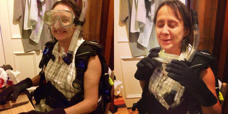
My mom, Judy, during Nitrogen Narcosis playtesting.

My mom, Judy, during Nitrogen Narcosis playtesting.

Judy, starting as Player Two, was a pretty good sport but griped about my father not having to wear anything. Now, my parents can be described as casual gamers at best – they play Angry Birds on my father’s Kindle and maybe a few other similar touchscreen games. With them, the game seemed to hit all the right notes. Although my mom told me halfway through the first game that, “personally, [she didn’t] care for this at all,” she then went on to play two more games, complete with trashtalking my father and cheating (they both cheated a little bit when they realized that the tic-tac-toe rules are completely player-enforced). My father suggested that the “taking turns” rule of tic-tac-toe should be enforced with programming, but I so appreciated the generative play of them each trying to play faster than the other and moving each other’s pieces around that I definitely think this should stay as is. When they were exploiting the loopholes and player-enforced rules, they seemed to be having the most fun.

When it came my father’s turn to be the ‘X’s, I could only convince him to wear the neoprene gloves. Throughout the game, he became so frustrated with the way that they limited his motor skills that he actually tore the gloves off. My father is one of my “constant readers” – I basically have him check out nearly everything that I create, and so he is skilled at stepping back from himself and giving me a considered perspective even of things that he doesn’t necessarily enjoy. His main reaction was, “I see what you’re trying to do here, and I think that it works. I just don’t want to wear those gloves again.”

After their playtest, I tweaked the positioning of the ‘X’s so that they all start in a pile on the side rather than scattered on the board – this had caused some confusion for my parents, since one of the rules of tic-tac-toe is that you can’t place your piece on a square with someone else’s pieces, and the ‘X’s start in certain positions. If the player is trying to follow the rules to the letter, that’s a legitimate concern. It was simple to change so I decided to do so.

Overall, the playtesting experience was positive and very constructive. I’m looking forward to see what people who don’t know me think of Nitrogen Narcosis. Creating the game has given me a much better handle on Stencyl and I’ve learned quite a few new tricks. It feels good to have finished this game – I think that I’ll lay off the scuba diving games for a while.

(I’ll be posting the game online soon, along with a possible list of alternate equipment for those players who don’t own their own scuba equipment.)
Curious Games: Expressive Play

curious games, Process Writing, research

When Pippin told us to go off and play expressively/personally, which is to say go and play a game in a way that deviates from the standard modes of play, it made me consider how much agency I really have in games. There are a lot of games where the kinds of play are fairly limited – where there’s not a lot of “world” to go and explore, or where there aren’t as many glitches to exploit. There’s also a lot of games where it seems like you have a lot of agency, but you have limited controls or in the end you’re being forced towards certain paths anyway.

After thinking about that a bit depressively for a while, I thought about instances of exploratory play that I had already engaged in. For example, in Skyrim, I engage in two activities that I also practice in real life: “scuba diving” – which is diving around on all the sunken boats in the environments, especially up north in the cold, and “rock climbing” – which is where I go over mountains that it should be impossible for me to walk on instead of finding the path in or around. I could list similar behaviours for all sorts of games: Unfinished Swan (where I would use the freeze time for paint globules function and then load up 100+ of them to make things like plants grow, or painting entire sections of the world completely black), all the GTAs, Fallout (where I would go off and explore the maps until I had visited every section possible, especially the secret vaults), and loads of others. I thought of doing it for Minecraft but decided that that was too easy since we were playing it this week anyway.

But, I wanted to choose a game for this and start some exploratory play in something completely new. So, I decided to play Fable 3 for the 360 and see what happened. I hadn’t yet played Fable 3. I had played Fable 2 and remember it being a fairly open world with interesting things to do, and what’s more, I remember it also being a fairly funny game.

After a few minutes of play, I started to run into things that said ‘unlock blah blah blah on the Hero’s Path to be able to do blah blah blah.’ What? This was not the Fable that I remembered, where anyone could do anything so long as they had the skill and the money. Well, I didn’t let that daunt me, although it did curb my enthusiasm a little bit.

In the end, I shook hands with everyone that I met (if you hold it to the sweet spot, you do a ‘handshake plus slap slap fist bump’ and people are pretty enthusiastic about it) and then, using the “hold hands” function, lead anyone who would hold my hand to one spot in Brightwood village. Then I played the lute for them in my own impromptu concert. They mostly liked it.

Honestly, there’s so much preamble to newer games that I should have known better than to choose an RPG/adventure game, but I find the worlds that are involved in those games particularly interesting. I didn’t have much success finding creative things to do in Fable 3 (since I haven’t even unlocked eating yet or something…in the old game, you could eat until you were really, really large and slow and you also had an “attractiveness” factor). So, instead I think I’ll go back to snorkelling in Skyrim.

Curious Games: I Broke It

adventures in gaming, curious games, indie, Process Writing, research

Last week, I was considering different solutions for altering the conditions of play and mood in my game. Pippin suggested that I use attributes, which can save certain information across scenes and across play sessions. What I decided to do is create different scenes and make them virtually identical to the initial scene, the only differences being the mood music and anything that I choose to add to increase the atmosphere of either euphoria or fear. I realized that it doesn’t even matter if you can play Tic-Tac-Toe in those versions of the scenes as long as the countdown is consistent across them and so is the number of games won. That seems doable.

However, after I duplicated the scenes and the code and made sure that code was pointing to all the right objects within the world, I somehow broke the other scenes (which means that really, they weren’t working in the first place). In the first instance, the console no longer appears even though I have visually placed it in the environment as an actor. Also, I am unable to move the actor that is supposed to move the camera around the level. The other level has the same problem, but compounded: neither the inflator nor the console show up in this level.

I’m going to debug by enabling and disabling parts of the code and seeing what I can do. Not looking forward to this! But that’s all part of the process, right? Then again, so long as I can get the camera to move, I am thinking that perhaps there’s a certain logic to not having those elements in those levels.

By the logic of the game, a euphoric person thinks that there’s nothing wrong in the world, and wouldn’t be concerned about readings on their console that say that they only have so much air left, or are at a certain depth. Similarly, in the “fear” level, the loss of the inflator could be considered a kind of loss of control over the player’s circumstances. But I still want to figure out what’s wrong. If I end up leaving them in, I want it to be intentional, not because I couldn’t figure out how to fix it.

I’m also getting very close to the point where I can no longer put off adding Tic-Tac-Toe to the game because a lot of things (like testing that score stays consistent…unless I want to program artificial scoring conditions) will only be able to be properly tested once I do that.

The rest of my work will involve adding more and more – Tic-Tac-Toe is the last absolutely essential element. That means more crazy euphoric animations of dancing fish (I have decided that this needs to be a thing in my game), more flashing lights, more bizarre decal-style photoshop brush effects appearing in level, more ominous things like perhaps dead fish floating around…More camera shake!

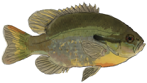
Please enjoy this picture of a fish. More soon.
sunfish

UPDATE: I appear to have fixed the motion problem (I just had the actor’s speed set too slow) but apparently my sound is creating some of my bugs.