Postmortem: Lone Wolf Commando Assault

adventures in gaming, Process Writing

[This post was written as part of a class assignment, but I thought you might be interested in seeing it as well. If you want to play Lone Wolf Commando Assault, you can find it here.]


LWCAscreenshot4

OVERVIEW

“This game would explore what it feels like to have non-combative options in digital spaces that are ostensibly ideal for combat. From dungeon-like caves to hills to canyons just perfect for an ambush, what kind of disruption, even momentarily, happens when game designers program in actions or objectives that go beyond our horizon of expectations?”

This is the question that I set out to answer based on the initial game design document for this project for Digital Games Theory and Research. The explanatory text at the end of Lone Wolf Commando Assault summarizes the message of the game thus “In games, it isn’t just that the design of a space determines its use, but also that only certain actions are programmed in for the player to have their avatar perform.” That, of course, isn’t the whole picture, or it wouldn’t have been necessary to make a game about it.

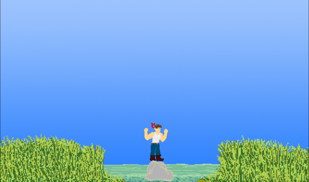
Lone Wolf Commando Assault is a three-level prototype where the player inhabits the role of Major Biefkake, “one tough mother who has seen the horrors of this world and fights to make it a better place.” In the game, the player navigates across sidescrolling (and in one case downscrolling) levels that lead them to various locations where, if this were a mainstream AAA game, there would be some kind of combat-oriented action to take, such as making a sniper’s nest, setting up an ambush, or entering into combat. Instead, those expectations are subverted — there are no combat-oriented actions programmed into the game, so the player has to choose to do something else instead.

CRITICAL DECISIONS

LWCAscreenshot2

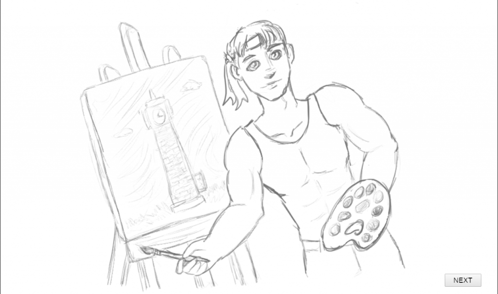
Somewhere along the way, the game began to critique elements of heteronormative, patriarchal masculinity. This started with my choice of avatar, I think, and blossomed out from there. Usually, I would deliberately avoid having the main character of my game a white male – not because white males aren’t good or anything, but because we’ve got plenty of them in games already. I thought about who the main character of the game ought to be instead, but decided that, in order to set the horizon of expectations for my players, considering that I would be working with limited resources compared to the lush 3D worlds of AAA games, I needed to highlight what that horizon was in other ways. So, I decided to make a character that could have walked out of Street Fighter or Mortal Kombat, with large arms, a white tanktop highlighting exaggerated muscles, and a soulful red bandana reminiscent of Rambo. Friends encouraged me to consider making levels that would also involve classic RPG characters, but given time constraints, I decided to focus in on the story of Major Biefkake, and I also made the decision to be kind to him. In writing the introductory text for the game, I tried to make use of the rhetoric of “fighting for peace” that exists in games (and around war more generally) where the word fighting usually means literally and peace as an end goal is used as a justification for violent action. This is how Major Biefkake came to be fighting to make the world a better place, looking to leave it kinder than when he was born into it. His possible actions are at least as effective if not more so than violence in making the world kinder.

From there, the very fact that Biefkake was a Rambo-Street-Fighter dude with big beefy arms who was not committing acts of violence, but flying kites, having picnics and exploring nature instead somehow made him humorous. Which, I guess, as a critique of how the patriarchy hurts men, is pretty scathing in and of itself.   

CHALLENGES

One decision that I made probably created quite a bit of extra work for me and may have made my critique of space slightly less effective: it was important for me that, other than the large “LET’S DO IT” and any UI considerations (such as the grenades on which the player’s options are written), all objects in the game be diegetic. What I mean by that is that I wanted to design levels where any items that I placed within them could reasonably be found there and feel natural. This made creating the platformer aspects of the game far more difficult, and in the end, I did have to make some concessions. The level that I am the least happy with is the third one, the Canyon level, where I had to put rocks sticking out because canyons don’t exactly have platforms and I didn’t want the player to just jump to the bottom of the canyon. That’s pretty much what happens anyway, though, and while I liked that this level changes the pace of the game, I’m unhappy with how short it feels and what the descent feels like.

Another major challenge was the amount of art assets that I set out for myself to create. I chose a fairly detailed style, and so each object was fairly time-consuming. The most time-consuming art assets, though, were the multiple-choice visual novel endings for each level. Although they have varying levels of details, having three levels meant drawing 12 manga-style pictures that had to feel like a visual reward for finishing the level. That meant paying quite a bit of attention to consistency across the drawings and that they had to be as good as I could make them. Also, since designing space was a key aspect of this game, I didn’t want to reuse objects from other levels. The number of art assets that it was necessary to create to make each level feel unique definitely made me limit the number of levels more than I would have liked. Thankfully, the programming for this was relatively simple, and I could reuse most of the code between levels. I’m glad that I decided to use Construct 2!

I arrived at most of my design decisions after careful consideration, and I think that what I would have changed about the game if I had to do it over is primarily time-constraint based. If I polished this game further, it would be to re-design the canyon level and add more levels. Perhaps there’s also more of a reward that I could give players at the end of each level – in a visual novel, this would be a photo album or something of that nature where players could review images that they got from getting particular endings or reaching particular points in the game. Maybe, in this case, it should be something like a comic, or maybe I should push the visual novel elements further and have players make more choices after the initial one.

LWCAscreenshot3

FEEDBACK

The feedback that I received from my peers and other playtesters for the game was positive. Many people appreciated the tone of the writing involved – one person noted that it managed not to be too preachy while still getting the point across. The critique that I was aiming for in the game seemed to come across, and that allowed people to engage with critiquing that critique – nice!

One person did note that it was at times difficult to tell an object in the foreground from an object in the background. That’s something that I would definitely work when polishing this game further – playing with lighting and perspective is a challenge for me as a visual artist.

One playtester noted that, “while [the game] critiques expectations about actions possibly in a different space in games, it doesn’t really offer the player more freedom, but simply replaces the static choices traditionally associated with the spaces with other choices, which (while refreshing as a subversion of standard tropes) are just as constraining.” My thoughts are that this is absolutely true – this is not a game that increases player agency. Instead, the inability to perform the expected actions is part of the point: we do what is programmed into the game for us to do, and we can’t really do anything else. Ultimately, I think constraining what a player is able to do in a game is part of a designer’s tool kit: if we could do anything – everything – that we wanted in games all the time, any time, then I think games would be a lot less interesting. While I enjoy emergent gameplay, I am especially pleased when a game supports my subversive play when I least expect it – it is a moment, mediated through the game, that a designer is sharing with me. “Yes,” that designer is saying, “I thought someone might want to try that in the game.” I don’t think that the point is for a game to give players every option that they might think of (because it probably won’t), but rather for games to start giving us more varied decisions overall to make in those spaces.

IN TUNE @ INDIECADE: A YEAR AND A MONTH OF MAKING A GAME

adventures in gaming, Process Writing, talks

E3promo

[Cross-posted here: tag.hexagram.ca/blog/]

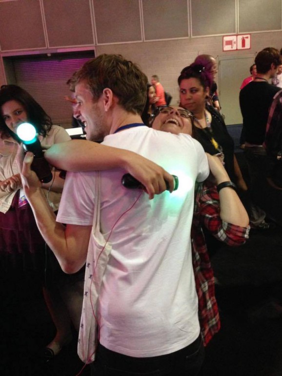
Last week was IndieCade 2015, a festival celebrating indie games in all their forms, and, thanks to TAG and many other folks, I was there with In Tune as an official Night Games selection. It has been one year and one month between the creation of the first prototype of the game and showcasing it at IndieCade as an official selection. In between, there have been many adventures.

OUR HEROIC ORIGIN STORY

In Tune was created at last year’s mLab-hosted satelite location of boobjam 2014, which happened at the end of September. Boobjam is a game jam that encourages creators to think about breasts in ways that they aren’t normally considered in games – as something other than objects for the straight cis-male gaze. Inspired by the theme of the jam, In Tune came about as we thought about bodies and their interactions. It is fair to say that we were also inspired by the awkwardness of bodies. Most importantly, it is concerned with the navigation of consent – firstly around those bodies and the negotiation of physical contact, and then, using that physical negotiation to extend the thinking into other areas.

ON THE ROAD

showcasesscreenshot

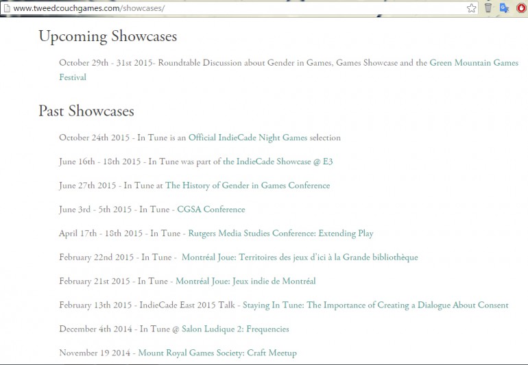
By now, In Tune has showed in many places, both locally and internationally. For each venue that we have shown it at, we have had to track down the safer space/inclusivity/anti-harassment or similar policy. We do not show the game in spaces which don’t have one, and always have a printed copy of the policy on-hand. This serves to raise awareness for the existence of such policies and makes sure that we are knowledgeable about available resources in case any concerns should arise when people play our game.

UNIQUE OR ALTERNATIVE INTERFACES AND SENSITIVE TOPICS

In Tune works with a Mac Computer (with an OS older than El Capitan), PlayStation Moves, a Makey-Makey, some wires, and handmade conductive sleeves that slip over the PlayStation moves. Our game has also been through many phases: first with tinfoil and PlayStation 3 Controllers, then with a variety of custom controllers (held together by solder, hot glue, and a prayer) and finally PlayStation Moves. This makes it a difficult game to judge for showcases like IndieCade. We have been lucky enough to have had judges that either heard about the game and believed in it based on the strength of the trailer and other documentation, or they got the chance to play it at other events (which the game was at because somebody either believed in it on the strengths of the trailer and surrounding documentation or got to play it at another event).

Due to changes in the way that bluetooth works on the latest releases of Mac OS (El Capitan), the API that we use to pair our PlayStation Moves to the computer no longer works, not to mention that getting PlayStation Moves to pair with PC has pretty much always been a difficult prospect (even the Copenhagen Game Collective wouldn’t touch it, in the end). So, we either have to keep a computer with an older OS (thus breaking many Apps on it) or continually be able to wipe a computer to bring it back to a version of the OS that works for us.

So, as you might be able to tell, the tech alone puts some restrictions on our ability to distribute In Tune as anything other than an installation piece, which is why it is so important for us that we get to take it around and show it. We are currently working on low-cost and low-time-cost ways to distribute the game. With the Makey-Makey Go coming out (hopefully this December), we think that we might be able to help people put together kits for under fifty or sixty dollars (used PS moves at 15USD per controller, the Makey-Makey Go for around 20USD, and then some conductive thread, wires and fabric).

However, even if it weren’t for the tech requirements of the game, this is a game with potentially sensitive content that has to be framed a certain way, and, perhaps most importantly, where the rules have to be carefully introduced. So, in considering how we share the game, we will potentially have to provide documentation and long-distance volunteer training in the future for the many people who have requested copies of the game for educational and workshop purposes. We trained a volunteer this weekend for the Green Mountain Game festival, and that went pretty well. Something to consider…

RECEPTION

You can read some of the articles that have been written about In Tune here: http://www.tweedcouchgames.com/what-theyre-saying/

It’s been getting quite a warm reception, and we have had a dozen requests from people who would like to show the game for workshops and other educational contexts.

IN TUNE @ INDIECADE 2015

Taking In Tune to IndieCade was a fascinating experience, both during our actual game showcase and for me as a “young game maker and scholar.” I was surrounded by and got to discuss with people who I have been reading about (Celia Pearce, Brenda Laurel) or playing games by, and it really helped my studies come alive for me. Perhaps especially because in English Literature, my focus was on Middle English studies when it wasn’t on Creative Writing, which means that many of the writers I was engaging with have been dead for many hundreds of years. That makes being a part of a relatively young medium like games and games studies very interesting.

The /Gaming for Everyone/ pavilion was my favourite spot throughout the festival, because so many excellent games that might not fit the traditional mold of the festival, or were late entries for newly made games, were able to showcase there as well as community organizations that are responsible for helping to get new and different people making games. I was so happy to see “We Are Fine, We’ll Be Fine” (http://wearefine.ca/) there along with Nicole and Hope, and to see a few folks from Pixelles Montreal there as well, along with similar initiatives from around the continent, including Dames Making Games and Different Games.

I also got to spend time with the incomparable Dietrich Squinkifer (Squinky for short) who may be joining us again in Montreal soon and the transplanted Allison Cole (former mLab coordinator currently doing her thing at the NYU Game Center). Squinky is much more familiar with the folks from the IndieCade community and was kind enough to let me tag along as their entourage and introduced me to many cool people.

Another highlight of the festival for me was Pillowtalk: A Keynote Conversation, which featured discussions of intimacy and consent with designers who I am personally very interested in, including Naomi Clark (Consentacle — always great to see another game concerned with consent!), Nina Freeman (who just released Cibelle today), and Robert Yang (Hurt Me Plenty).

Overall, I think that I could have had a very different experience of IndieCade just depending on which events I chose to go to and which tents that I entered, but that I had the options that I did is a good thing, even as IndieCade grows larger and larger… I imagine that sustaining the event’s character with all of that growth is a challenge. I’ll be keeping an eye on how the IndieCade organizers handle it all.

Critical Making and Design: Rita Hayworth Isn’t In This Game

adventures in gaming, critical making, Process Writing

This week, for my directed reading course, I attempted to make a game using alienation theatre techniques, as described by Brecht in his Organum on Theatre. The only person that has playtested it so far is my husband, so I only have his and my own opinions to go on so far to judge how well the project turned out. For what it’s worth, I had fun with it! I will also be reading Boal’s Theatre of the Oppressed and Frasca’s Videogames of the Oppressed, but have deliberately avoided reading and engaging with them until after I finished making this game and writing about it.

As a reminder, you can watch a bit of the film as a reminder of some of the scenes that I’ve taken inspiration from…

This is a game for people who have seen The Shawshank Redemption. It probably won’t do anything for you if you haven’t. That being said, you should both read “Rita Hayworth and the Shawshank Redemption” and watch “The Shawshank Redemption” if you haven’t already.

You can play the game here: http://jekagames.itch.io/rita-hayworth

Specifically, the Brechtian concepts I’m engaging with are the ones elucidated in sections 39, 41, 43, 44, 47, 48, 49, 50, 51, 54, 67, 72, 75, of Brecht’s Organum. You can read paraphrase notes on the Organum here: http://peterbuwert.com/research/?p=69 – I found them helpful, because while Brecht writes very well and has interesting things to say, it can be hard to tease out a simple summary to describe his meaning. I’ll pull out some of Buwert’s paraphrases to explain some of my choices for this game.

Sections 47, 48, 49, 50 and 51 are perhaps the ones that influenced me the most for the game.

“47. The actor must abandon all attempts to get the audience to identify with the character. His speech must not flow in the way we expect an actors speech to flow ‘parsonical sing-song’.”
(Buwert)

Morgan Freeman’s voice is itself a character in cinema – his warm, friendly narration is unmistakable. So I got rid of it. Much of the audio in the game consists of truncated text-to-speech versions of Freeman’s voiceover. I have to say, it almost hurts. But, for me, hearing his lines interpreted by CodeWelt’s CW Speak both calls to mind the film, Freeman himself, and a strange reality (the one I have created) where it isn’t Morgan Freeman speaking the lines – thus separating the actor from the character, as is suggested in section 48 and 50.

Similarly, in the opening introduction/contextualization of the game, I identify the “agents” of the game (the “yous” that I address with “You are,” if you will): Andy Dufresne, the actor that portrayed Andy Dufresne (Tim Robbins) and the player, further trying to separate the actor from the character and, as in section 49, trying to demonstrate the thoughts of opinions of all those agents. I tried to keep this separation clear by addressing the Player in the various mini-games, also writing in opinions for actor Tim Robbins (who would like to win an Oscar), and instructing the Player to “help Andy,” further highlighting the separation between the two of them.

Sections 51 and 72 say, in paraphrase:
“51. In order that the viewer identifies the character as being the portrayal of a particular individual at a certain moment in a certain situation, all illusions that the actor is the character and the set is the location must be broken.”

“72. The composer is liberated in no longer having to create an atmosphere to aid spectator immersion. Likewise the set-designer no longer has to create the illusion of an actual place. The set should give hints of greater interest than a mimetic representation would.”

Many of my aesthetic choices for the set pieces and character animation stem from these two sections. I was also limited by time, having made this game in under a week, but I also deliberately chose to not model the sets after those seen in the movie (with the exception of the pipe scene, which I really wanted to feel like the movie even if it didn’t quite look like it). Similarly, there is no music in the game because Brecht suggests in section 71 that songs should not be used for emotional expression or discharge — which is exactly the use of all the music in the film. Trying to use songs to demonstrate something extra, on top of all the other outputs of the game (text, audio, visual, etc) seemed like it would be excessive.

Section 41 says, in paraphrase by Buwert:
“41. It is a process of sketching, where ‘the way it is’ is accompanied by a multitude of possibilities of ways ‘it could be’.”

To represent this, I have animated a ghostly character, identical to Andy/Tim who follows Andy/Tim around and performs other possible outcomes – mostly involving walking in the other direction or tripping.

“44. Things which never seem to change seem to us unchangeable. The viewer must be amazed by the familiar and through this come to question and interrogate normality.”
(Buwert)

Section 44 affected my choice of material. The Shawshank Redemption is a much-loved movie and, according to IMDb, it, along with The Godfather, are the top-rated movies of all-time. It also features, as previously mentioned, Morgan Freeman’s voice, and other things that seem constant and comforting. As such, I felt it was appropriate material for this game.

Finally, as Brecht reminds us in section 75, my goal was entertainment, to some degree, and so I tried to keep a good sense of fun and humour throughout the game.

Okay, time for what went well and what didn’t go so well:

THE BAD
– This game took way longer than I anticipated, and I only started to make it on Saturday after carefully considering what I would do, because all of my work seemed to take longer than it should have this week.

– The bugs! One problem with working with a semi-WYSIWYG program like Construct 2 is that it isn’t always clear why something goes wrong. Specifically, I had a great deal of trouble with audio for this project, and without the audio, the project sort of falls apart, without the absence of Morgan Freeman’s voice and other contextualizing quotes from the film.

– As always, I am learning to use different design approaches to make games and other objects, and I don’t know how well I am reconciling making a “good” game and getting the ideas that I intend to across. For what it’s worth, my one playtester seemed to get the sensations and provocations that I was going for.

– I’m still not programming in JavaScript or learning a programming language…I think I’ve got the logic down, though, and someone recently suggested this cool-looking game to me for further practice: The Human Resource Machine (http://tomorrowcorporation.com/humanresourcemachine). I plan to start in Phaser soon with JavaScript, if I ever find the time…

THE GOOD
– Those SHOES – I’m quite happy with my shoe-shining animations.

– Global Variables: I used something like five or six global variables as switches in this game, and I’m quite happy with the results. I feel like this game was excellent practice for me.

We’ll see what players have to say!

Critical Making and Design: Cultural Ambassadors

adventures in gaming, critical making, Process Writing, research

This week, I made a game called Cultural Ambassadors by attempting to defamiliarize Space Invaders and the act of shooting.

Given that I had just a week (and that I am trying to limit the number of hours I spend on this one class), I started with someone else’s Space Invader clone made using Construct 2. In playing it, it quickly became clear that this wasn’t quite a perfect clone of the original game, but close enough for the base on which I would build this new game.

GolbosonGlobesletter

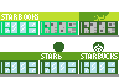
Taking a common way that I’ve seen defamiliarization explained (“What if an alien encountered this cultural object – how would they understand it?”) to its natural conclusion, I made a game where aliens are enamoured with our television commercials and think that places like Starbucks and McDonalds are really kind of awesome — and isn’t it a shame that not everyone has access to the rolled back prices of Walmart? So, helpfully, the Golbos on Globes team (they were very impressed by Holmes on Holmes and Extreme Makeover: Home Edition) has decided to make over your planet…starting with your town. And by you, I mean a tiny robot carrying a book with the ability to beam cultural objects up to these aliens to counteract all that they have learned from cable commercials.

bookrobot

As errant hammers fly, there’s the chance that they’ll miss the building that they are converting and accidentally hit you instead. Meanwhile, you send them books, movies, games, music and other cultural objects to take a look at. Those who are affected by them have minor epiphanic moments (“oh I see”, “I understand!”, “now I get it”) and leave Earth’s skies.

Here is the list of items that the game chooses from for you to throw:
“Throwing Cultural Object: ” & choose(“Octavia Butler’s Kindred”,”Will Shakespeare’s Plays”,”Gone Home by Fullbright”,”Jesus Christ Superstar”,”Amadeus (1984)”,”Tanya Tagaq’s Throatsinging”, “Thomas King’s Green Grass Running Water”, “Schindler’s List (1993)”, “Europa Europa (1990)”, “Carl Sagan’s Cosmos”, “Anita Diamant’s The Red Tent”, “Marjane Satrapi’s Persepolis”, “Kurt Vonnegut’s Welcome to the Monkey House”, “Squinky’s Coffee: A Misunderstanding”, “Margaret Atwood’s The Handmaid’s Tale”, “Harper Lee’s To Kill a Mockingbird”, “S. E. Hinton’s Rumble Fish”, “Jean Paul Riopelle’s La Roue/Cold Dog – Indian Summer”, “The Inevitable Defeat of Mister and Pete (2013)”, “Idiocracy (2006)”, “Journey by Thatgamecompany”, “Anna Anthropy’s dys4ia”, “Ralph Ellison’s Invisible Man”, “Arundhati Roy’s The God of Small Things”, “Bryce Courtenay’s The Power of One”, “Paul Coelho’s The Alchemist”, “Richard Adams’ Watership Down”, “Papo y Yo by Minority”, “Simon and Garfunkel’s The Sound of Silence”)

Given that the game was made in under a week, I mostly went with what occurred to me to chuck at aliens if I wanted them to understand my culture beyond McDonald’s commercials – which feels fine for a prototype. However, also, given that the list is short, each entry matters more… I had to decide if my loving a cultural object and thinking that it was interesting was enough for it to go on the list – and I tried to mostly stay away from “canon important cultural objects”, which are mostly the work of dead white dudes, and instead include a bit more variety. Then again, I happen to love Shakespeare and chose to include his work — and I guess that it’s okay to appreciate and love an object even understanding that it might contribute to a problem or be problematic, something that I occasionally wrestle with. I tried to balance it out with work by creators that I feel might be underexposed or would be excluded from the canon.

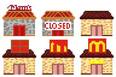
McDonaldsStorefront

StarbucksStorefront

WalmartStorefront

Something that you might be interested to know is that I have never made a game that involved the act of shooting before. That’s a conscious decision and that might actually be why I chose shooting as something to defamiliarize. However, because I started from Space Invaders, there’s some meaning embedded in the rules already, and the act still feels oppositional. There’s a lot of history in the act of shooting, I guess, and shooting hammers or wifi beams doesn’t erase that, especially in as familiar an object as Space Invaders. Trying to get shooting to feel like something other than shooting is difficult. What I think does work is this idea of accidental or unintended harm on the part of the aliens and their colonizer attitude. What doesn’t work, is, as I’ve mentioned, this sense of opposition — that we should shoot at the other, or assume that they mean us harm.

One of the things that I am quickly realizing about my approach to design work, having done three projects in three weeks, is that I enjoy making things that revolve around some element of humour, but that I want my audience to be in on the joke – or I want it to be possible for them to be in on the joke without too many obstacles.

Critical Making and Design: Defamiliarization Posters

critical making, Process Writing, research

So far, what I am learning about myself as a designer is that I have a hard time leaving humour out of the equation. For example, last week, I suggested that we dump baking soda in the ocean to help the pH and strap aquarium filters to dolphins to protect them from the folly of man. This week is no different.

My task for this week was to design two posters that advertised defamiliarized objects (and, as a consequence, to engage in the defamiliarization of two objects). The easiest way to explain what that means is to direct you to this video:

(Any blog post where I get to put in a video of The Little Mermaid is good by me!)

Defamiliarization takes an object and reimagine a use for it, or imagines what an alien consciousness would think it was used for, if they didn’t have anyone to explain it to them.

This assignment was way harder than I expected it to be. I guess that this means that I have trouble separating some objects, especially the really familiar ones, from their uses. I think that if I had chosen more complex or uncommon objects, it would have been easier to defamiliarize them, but then they would have meant less because they were less recognizable to start with. Some objects were harder to separate from their uses than others – for example, I could not seem to dissociate chairs from sitting.

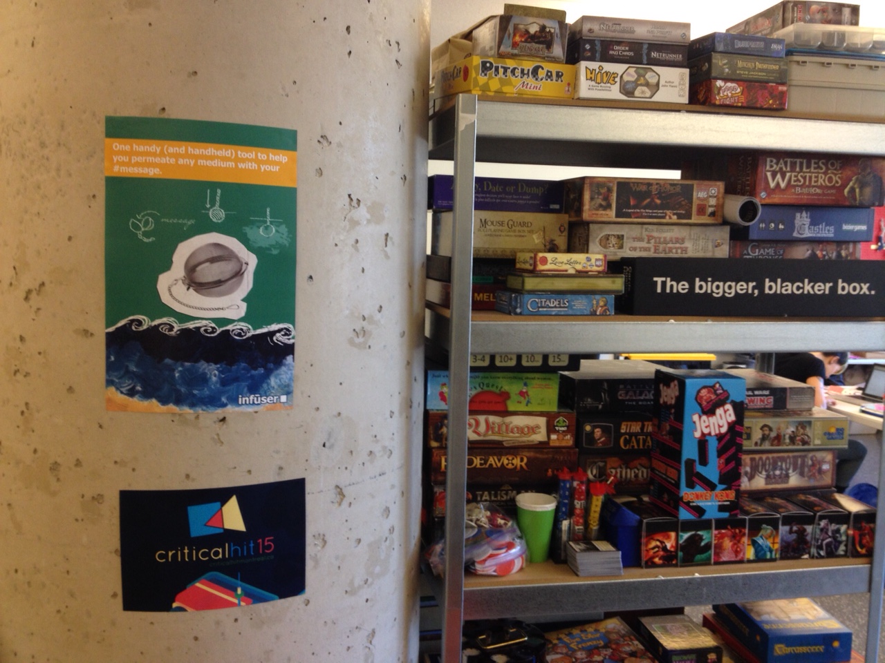
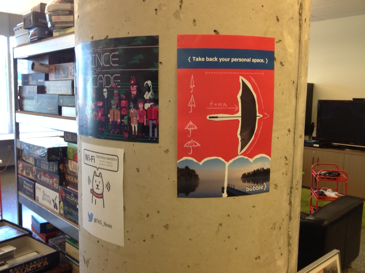
Here are the results, installed in the “wilds” of the TAG Research Lab:

theinfuserInstalled
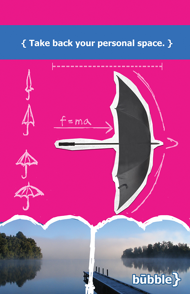
MyBubbleInstalled

Since I had two posters to design, I chose to approach each object with a separate way of attempting to defamiliarize them.

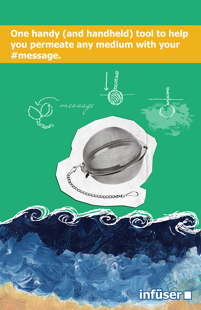
theinfusersmall

The first object, the “infuser,” was designed using a language-based approach. I thought about the words “infuser”, “diffusion,” and other related terms. I worked at defamiliarizing the language associated with what infusers do, and thought of words that had multiple meanings, such as “medium.” What I ended up with is partially a visual gag and partially a verbal gag — many mediums are present on the page: water – and paint representing water, print, paper, writing, and the internet (represented by the hashtag). Then, for good measure, the phrase references Marshall McLuhan and that tired, oft-misunderstood old chestnut, “the medium is the message.” Of the two posters, I think this one is the least successful.

(FUN FACT: The painting in the bottom third of the poster is something that I painted when I was 15 years old.)

mybubblesmall

The second object, the “bubble,” was not what I had originally decided on making. Initially, and yeah, this one might also have come to me in a dream, much like the DELFINOX, I wanted to design a clock that would teach you to dance based on the different gradations. As you got better at learning dance steps, you would use shorter and shorter intervals to learn. So, you could use the different intervals on the clock – seconds, minutes, 5-minute chunks, 15-minute intervals, half-hours, whole hours. It quickly became clear that this would be impossible to communicate in an ad or on a poster.

The bubble, instead, is based on something that tall people know all about: accidentally hitting people or being hit with an umbrella. Or, in the case of this object, not so accidentally. This object imagines leveraging this accidental quality of the umbrella with intent – to take back one’s space. About some of the visuals in the poster: the trees at the bottom with the empty space in between are meant to recall large crowds which have been parted to leave elusive personal space in-between! The formula, f=ma, is meant to suggest the motion of the umbrella, coupled with the directional arrow. The curly bracket is also vaguely shaped like the top of an umbrella, which is why I also included it in the “logo.”

So far, the posters have been up for about five hours, and already a few people have commented to me that they love the idea of taking back their personal space. I was very stealthy when I put them up, and surely no one knows their source.

Critical Making and Design: Thinking about DELFINOX

critical making, Process Writing, research

This September, I’ve officially started my PhD, and with it, a pretty amazing directed reading course with my supervisor, Dr. Rilla Khaled, entitled “Critical Making and Design”. Since we’re keeners, we started a little earlier than the class start date, and I’ve already had the chance to do a bit of design work and am learning a lot. With that in mind, I’ve decided to start this series of blog posts talking about the design process and the objects themselves.

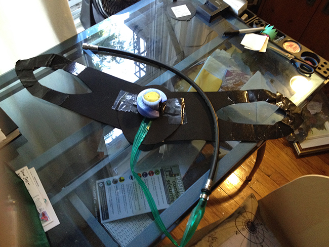
The first object is called the DELFINOX and it is a filter system for dolphins to help them in their “double-bind” between ocean acidification and pollution and air pollution. Here is a PDF document that is meant to accompany the object.

Delfinox Picture small

This is the object itself. It’s made of mostly recyclable, reusable or reused materials, with the exception of some duct tape and a few materials that I’m unsure about. The blue plastic is PLA, or polylactic acid plastic. The green tubing is recyclable plastic, possibly originally intended for aquarium use. The black rubber hose is borrowed from a small stash of extra scuba diving equipment that my household has around. There’s also crafting foam used to approximate neoprene and part of a household sponge for the filtration system.

The instructions for this object were fairly free-form – in a nutshell, they were to make a thing and see what happens. Dolphins were not my first thought.

At first, I discussed what I had to do at length with just about everyone who I happened to be spending time with – friends, family, other researchers. I was excited – this was my first official PhD assignment after all – and my first formal design object.

So far, the critical design examples (and I’m using that term very broadly, thinking of design as a spectrum where designs can be critical or affirmative of existing norms and practices to varying degrees) that I’ve been reading about are, at their core, about anxieties or fears. Many deal with the fear of death in some form, whether it be Dunne and Raby’s huggable plush mushroom clouds (from Designs For Fragile Personalities in Anxious Times, 2004/05), or the Prayer Companion (an object that I find a bit questionable, both in terms of taste and the tone in which the project is framed).

At first, in searching for my design inspiration, I thought a lot about waiting. I thought about what I do when I’m waiting, how waiting alters my perception of time, how maybe waiting could be a good thing – which led me to the converse. What happens when waiting is a really bad thing? What happens when we wait too long?

I’ve been a scuba diver for eight years now, and a human being on the planet earth for, oh, just a little bit longer than that. I think about water a lot – and that means I think about climate change and their impact on the water, too. It is something that makes me anxious, because it often feels like I have very little direct control over it. And, although I am hopeful, so far, we have been surprisingly short-sighted and stubborn as a species when it comes to our approaches for dealing with climate change.

Now, I know this is a bit silly, but after thinking about the project for a few days, the idea for DELFINOX came to me in my sleep. In the morning, I joked with Tom (my husband) about it a bit, as I imagined this object: “What are we going to do, fit aquarium filters onto all the dolphins? Well…maybe.”

Despite knowing that the object would not in fact have to work, and would probably never be within 100 kilometres of a dolphin, it was nevertheless important to me that my approach was possible, if improbable. I studied dolphin physiology – specifically, how dolphins breathe and how blowholes work, and I thought about how my scuba diving equipment operates. I wanted to design something that, in theory, wouldn’t need an air tank (even rebreathers need a small cylinder). However, most dolphins surface fairly often for air (about every 15 minutes or so), so it wasn’t necessary that there be a whole lot of air in the system, just that it could filter through the system sufficiently to be scrubbed before the dolphin needed it, or enough for there to be an emergency supply. So, I added a longish tube that would rest against the dolphin’s body.

In terms of powering the device, dolphins swim fast and can expel air fairly strongly through their blowholes. It made sense to me to use the motion of the dolphin to power the device, sort of like the way that the motion of the water is used in hydroelectricity, or, that classic comic idea of a hamster running in a wheel.

My choices when it came to crafting the physical object were based on three goals: trying to reuse objects that I already had on-hand (such as previously printed items from my 3D-printing recycling box, or the borrowed scuba hose), trying to remind the viewer of an aquarium filter, and trying to make choices that would be comfortable, unlikely to be torn off, and practical long-term for a dolphin.

In a way, this object, although the notion of fitting each and every dolphin with one may seem impossible, is about taking back control over something that seems so far beyond my control. Feeling a personal responsibility for climate change as one of billions of people is an uncomfortable feeling. This object imagines a future or even a present where human beings do feel responsible for each and every dolphin, for example, and take personal responsibility for them. It is too easy to lament about climate change and say that there is nothing to be done. Collective actions start with individual ones, I guess.

A SMALL SIDEBAR: Because this came up when I was talking about the project a few times, I thought I’d share this somewhat gruesome story that I had in mind while working on this project. Dolphins have a particular history here in Montreal: for Expo ’67, the city acquired dolphins, which were hosted in the Montreal Aquarium (also known as the Alcan Aquarium, a company my father used to work for). After Expo, people sort of forgot about the aquarium, and in 1980, there was a blue-collar workers’ strike. The six workers who were responsible for feeding the dolphins refused to do so, and three of the six dolphins starved over a course of months. Their trainers tried to save them at the end, but they waited too long.

You can watch footage of their arrival to Montreal here.

Here are two newspaper article detailing the event at the time:
The Evening Independent

Spokane Daily Chronicle

Ebbs and Tides, or how I get distracted

administrative, adventures in gaming, Process Writing

As you might well know, this site goes through periods of activity and inactivity as my attention is focused elsewhere.

If you’re curious about where I’ve been writing lately, you can take a look at the Critical Hit website. I co-directed the program this summer, which I think is a nice trajectory. I participated in Critical Hit 2013, helped to run the program for 2014, and this year was one of the three co-directors for it. Pretty neat!

Anyhow, you should now expect a period of activity as I try to make a habit of writing about my work and specifically, the design work that I am doing for my PhD with my primary supervisor, Dr. Rilla Khaled. Yes, I’ve just started a PhD to become a Doctor of Video Games! I thought that this would be a good home for writing about that.

You might also be interested in checking out what kind of feedback my games over at Tweed Couch have been getting – check that out here!

Apple Rumble Available Online!

adventures in gaming, game jams, Process Writing

Hi all,

I’ve been very busy over at Tweed Couch Games with Allison and Zach (we have some sweet dev blogging going on over there), but I wanted to take a moment to remember this game.

So, I never did put this game up online, mostly because it was just a ridiculous bit of fun that I had thrown together on my own during a jam…But then I realized that this year’s pre-jam was coming up, and that the THIRD COHORT (wow, I can’t even believe that the Pixelles Incubator is in its third year!) of the Pixelles are having their showcase this week, so I decided to put up Apple Rumble on itch.io.

You can totally play it now!

Summer Update

administrative, adventures in gaming, Process Writing

Hi everyone,

Just so you know, for the summer, I’ve mostly migrated over to criticalhitmontreal.ca, where I am doing most of the blogging. In particular, you should check out my interviews with the participants!

Since the last time I wrote, I both got married and defended my Master’s thesis within four days this May. That was exciting! I also started a Patreon, and if you like my writing and my games, then I would love it if you went on over and checked it out. Recently, I was given advice that I should probably a bit more “braggy” about what I’ve done for it. I guess maybe I’ll try and add some sort of optional section that is basically my CV!

You can expect me to be back to my regularly-scheduled games’ talk fairly soon, as I’m creating an interactive fiction game about the associative qualities of memories in the house I grew up in.